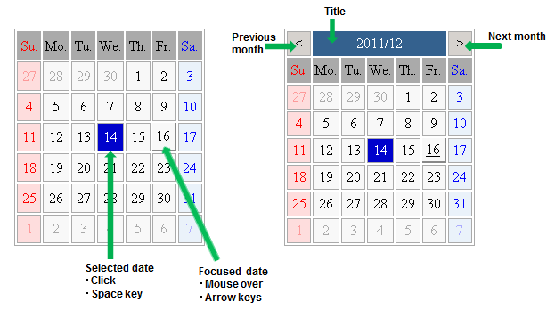
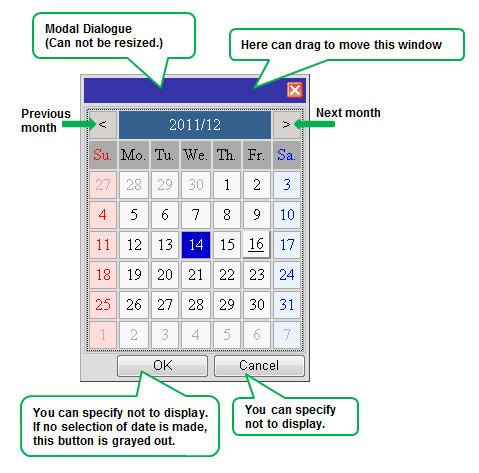
Calendar widgets are widgets for displaying calendars. You can display a calendar directly in the form or display a pop-up calendar.
This section explains how to use calendar widgets.
Calendar is the widget for displaying a calendar. Users can select a date in the displayed calendar.
Sample Display

Format
<div rcf:type="IBPMCalendar" ... ></div>
Note
You cannot specify child elements. Refer to 4.4.1.4 Behavior when child elements are specified for widgets that cannot contain child elements for details.
Point
Properties
The meaning of the column headers is explained in Properties topic of the section 4.2.1.1 Text.
Name | Data Type | Description | Required | Default Value |
|---|---|---|---|---|
year | Number | Specifies the year to display in the calendar (1 or more). | No | Current year of the system date |
month | Number | Specifies the month to display in the calendar (0-11). | No | Current month of system date |
firstDayOfWeek | Number | Specifies the first day of the week to display in the first day column. The range of values is from 0 (Sunday) to 6 (Saturday). | No | 0 (Sunday) |
selectedDates | - | Cannot be specified in Systemwalker Runbook Automation Studio. | - | - |
daysOfWeek | String array | Specifies the days of the week listed across the top of the Calendar (from Sunday to Saturday). You can specify a sequence of seven day-of-the-week character strings separated by semi-colon starting from Sunday. | No | ["Su.", "Mo.", "Tu.", "We.", "Th.","Fr.","Sa."] |
holidays | - | Cannot be specified in Systemwalker Runbook Automation Studio. | - | - |
specialDates | - | Cannot be specified in Systemwalker Runbook Automation Studio. | - | - |
dateToolTips | - | Cannot be specified in Systemwalker Runbook Automation Studio. | - | - |
naviType | String | Specifies how to display the navigator.
| No | ALL |
naviButtonRenderer | - | Cannot be specified in Systemwalker Runbook Automation Studio. | - | - |
naviTitleLabelProvider | - | Cannot be specified in Systemwalker Runbook Automation Studio. | - | - |
dayOfWeekCellRenderer | - | Cannot be specified in Systemwalker Runbook Automation Studio. | - | - |
dateCellRenderer | - | Cannot be specified in Systemwalker Runbook Automation Studio. | - | - |
tabIndex | Number | Specifies the tab order when moving the focus with the Tab key. | No | 0 |
selectable | Boolean | Specifies whether or not the date can be selected.
| No | true |
selectMode | - | Cannot be specified in Systemwalker Runbook Automation Studio. Users can only select one date. | - | - |
utc | - | Cannot be specified in Systemwalker Runbook Automation Studio. | - | - |
You can also specify common properties for widgets. Refer to 4.2.4 Common Properties for Screen Widgets for details.
Point
When you want to change the character string displayed as a day of the week, specify the character string in the daysOfWeek property.
Example: When you want to change the day of the week to Sun;Mon;Tues;Wed;Thurs;Fri;Sat, describe the following.
<div rcf:type="IBPMCalendar" rcf:daysOfWeek=Sun;Mon;Tues;Wed;Thurs;Fri;Sat ></div>
Operation | Process |
|---|---|
Clicking on Previous Month button | Displays the previous month. |
Clicking on Next Month button | Displays the next month. |
Clicking on a date | Toggles the selection status of the clicked date. |
Double-clicking on a date | Selects the clicked date. |
Hovering over a date | The date over which the mouse is hovering gets the focus. |
Operation | Process | |
|---|---|---|
Space | Toggles the selection status of the focused date. | |
Left cursor | - | Shifts the focus to the previous day (within the displayed range). |
+ SHIFT | Displays the previous month. | |
Right cursor | - | Shifts the focus to the next day (within the displayed range). |
+ SHIFT | Displays the next month. | |
Up cursor | Shifts the focus back one week (within the displayed range). | |
Down cursor | Shifts the focus forward one week (within the displayed range). | |
Home | Shifts the focus to the first day of the displayed month. | |
End | Shifts the focus to the last day of the displayed month. | |
PageUp | Displays the previous month. | |
PageDown | Displays the next month. | |
Style Properties
Part Name | Prefix | Class Name | Available Styles |
|---|---|---|---|
Whole widget (external frame) | None | rcf-IBPMCalendar |
|
Cell (common to all) | cell | rcf-IBPMCalendar-cell |
|
Navigation title | naviTitle | rcf-IBPMCalendar-naviTitle |
|
Navigation button | naviButton | rcf-IBPMCalendar-naviButton |
|
Day of the week header (common) | dayOfWeek | rcf-IBPMCalendar-dayOfWeek |
|
Day of the week header (individual) | dayOfWeek0 | rcf-IBPMCalendar-dayOfWeek0 rcf-IBPMCalendar-dayOfWeek6 |
|
Date (common within the current month) | date | rcf-IBPMCalendar-date |
|
Date (per day of the week within the current month) | date0 | rcf-IBPMCalendar-date0 |
|
Date (common except within the current month) | otherMonth | rcf-IBPMCalendar-otherMonth |
|
Date (per day of the week except within the current month) | otherMonth0 | rcf-IBPMCalendar-otherMonth0 |
|
Focused date | focus | rcf-IBPMCalendar-focus |
|
Selected date | selected | rcf-IBPMCalendar-selected |
|
Holiday | holiday | rcf-IBPMCalendar-holiday |
|
Special day | special0 | rcf-IBPMCalendar-special0 |
|
Refer to 4.2.5 Style Properties for details.
Note
The calendar is a table with TD elements for each day.
You can also specify custom styles for days of the week in Date (within the current month), Date (except within the current month) and Day of the week header.
In such a case, add a numerical value denoting the day of the week after the prefix and class name.
(For example: Sunday0...Saturday6)
The default order of priority for date cell styles is as follows:
selected
focus
special0..9
holiday
date0..6 / otherMonth0..6
date / otherMonth
cell
Apart from whole widget (external frame), you can only set styles using CSS. When setting styles in CSS, specify the styles in reverse order of priority.
Styles set in CSS take precedence over default styles. If you only define styles of low priority (such as cell or date) in CSS, default styles of higher priority (such as selected or focus) may be ignored. To avoid this, define all required styles in the correct order of priority.
PopupCalendar is the widget for displaying a pop-up calendar. PopupCalendar is used with CalendarButton to create a pop-up window in which users can select a date.
Sample Display

Format
<span rcf:id="uda_var1" rcf:type="IBPMDateInput" ...></span>
<div rcf:id="IBPMPopupCalendar_1" rcf:type="IBPMPopupCalendar" rcf:targetDateInputId="uda_var1" ...></div>
<span rcf:id="CalendarButton_1" rcf:type="CalendarButton" rcf:target="IBPMPopupCalendar_1" ...></span>
Note
You cannot specify child elements. Refer to 4.4.1.4 Behavior when child elements are specified for widgets that cannot contain child elements for details.
Properties
The meaning of the column headers is explained in Properties topic of the section 4.2.1.1 Text.
Name | Data Type | Description | Required | Default Value |
|---|---|---|---|---|
selectedDate | - | Cannot be specified in Systemwalker Runbook Automation Studio. | - | - |
labelOK | String | Specifies the label text on the OK button. If you specify an empty string (""), the button is not displayed. (*) | No | "OK" |
labelCancel | String | Specifies the label text on the cancel button. If you specify an empty string (""), the button is not displayed. (*) | No | "Cancel" |
targetDateInputId | String | Specifies the ID of the DateInput to display the date selected in the calendar. | No | "" |
(*)If you specify an empty string for both labelOK and labelCancel, the footer part (where the OK button and cancel button are displayed) is not displayed.
You can also specify common properties for widgets. Refer to 4.2.4 Common Properties for Screen Widgets for details.
Note
You can not specify the following properties of Calendar:
-firstDayOfWeek
-daysOfWeek
Point
When you want to change the character string displayed in the button of the footer, specify it in the labelOK property or in the labelCancel property.
Example: When you want to change the character string of the cancel button to "CANCEL", write the following description.
<div rcf:id="IBPMPopupCalendar_1" rcf:type="IBPMPopupCalendar" rcf:targetDateInputId="uda_var1" rcf:labelCancel="CANCEL"></div>
Style Properties
Style properties of this widget are shown below.
Part Name | Prefix | Class Name | Available Styles |
|---|---|---|---|
OK/Cancel button | button | rcf-PopupCalendar-button |
|
You can also specify Calendar style properties. Refer to Style Properties in 4.2.3.1 Calendar for details.
However, note that the prefix and class name of the style property for the whole widget (external frame) is as follows:
Prefix: calendar
Class name: rcf-IBPMCalendar-calendar
Refer to 4.2.5 Style Properties for details.
Additional Notes
You cannot use <div> tag style attributes (such as position, top and left) with this widget. Refer to 4.1.2.3 Attributes that can be used with UI Widget div tags and span tags for details.
Specify the top and left in style properties. Values specified in CSS are ignored.
CalendarButton is the widget to display a pop-up calendar. CalendarButton is used with PopupCalendar.
PopupCalendar is displayed when CalendarButton is clicked or when the Enter key or space key is pressed with focused CalendarButton.
Sample Display
![]()
Format
<div rcf:type="CalendarButton" rcf:target="popupCalendar1" ... ></div>
Or
<span rcf:type="CalendarButton" rcf:target="popupCalendar1" ... ></span>
Note
You cannot specify child elements. Refer to 4.4.1.4 Behavior when child elements are specified for widgets that cannot contain child elements for details.
Point
This widget is displayed as follows:
Using with <div> tag, line feed is inserted before and after the widget.
Using with <span> tag, line feed is not inserted before and after the widget.
Properties
The meaning of the column headers is explained in Properties topic of the section 4.2.1.1 Text.
Name | Data Type | Description | Required | Default Value |
|---|---|---|---|---|
alt | String | Specifies alternative text for the image. | No | CalendarButton |
enabled | Boolean | Specifies whether or not the button is active (enabled).
| No | true |
target | String | Specifies the ID of the displayed PopupCalendar. | Yes | - |
tabIndex | Number | Specifies the tab order when moving the focus with the Tab key. | No | 0 |
You can also specify common properties for widgets. Refer to 4.2.4 Common Properties for Screen Widgets for details.
A sample display and corresponding specification of PopupCalendar, DateInput and Text (for displaying an error message) are as follows:
![]()
 ...
<span rcf:id="uda_var1" rcf:type="IBPMDateInput" ...></span>
<div rcf:id="IBPMPopupCalendar_1" rcf:type="IBPMPopupCalendar" rcf:targetDateInputId="uda_var1" ...></div>
<span rcf:id="CalendarButton_1" rcf:type="CalendarButton" rcf:target="IBPMPopupCalendar_1" ...></span>
...
The input order is as follows:
Click CalendarButton.
PopupCalendar is displayed.
Select a date in PopupCalendar.
The date is input in DateInput through the UDA var1.
Style Properties
Part Name | Prefix | Class Name | Available Styles |
|---|---|---|---|
Whole widget | None | rcf-CalendarButton |
|
Details of the verticalAlign style are as follows:
Name | Data Type | Description | Default Value |
|---|---|---|---|
verticalAlign | String | Specifies the vertical alignment of the button. | baseline |
Refer to 4.2.5 Style Properties for details.