Container widgets are widgets for placing multiple screen widgets.
This section explains how to use container widgets.
ViewContainer is the widget for specifying screen information (container).
ViewContainer can contain HTML elements in child elements, and the whole can be handled as one widget. ViewContainer is used in ViewStack and TabPanel to specify views.
Format
<div rcf:type="IBPMViewContainer" ... >
    HTML element
</div>
Point
You can specify HTML elements and UI widgets in child elements.
Properties
The meaning of the column headers is explained in Properties topic of the section 4.2.1.1 Text.
Name | Data Type | Description | Required | Default Value |
|---|---|---|---|---|
label | String | Specifies the tab name when used as a child element of the tab panel. | No | "" |
You can also specify common properties for widgets. Refer to4.2.4 Common Properties for Screen Widgets.
Style Properties
Part Name | Prefix | Class Name | Available Styles |
|---|---|---|---|
Whole widget | None | rcf-ViewContainer |
|
Refer to 4.2.5 Style Properties for details.
Additional Notes
Panel is the widget to display a container with a title bar. This consists of title part and body part.
Sample Display
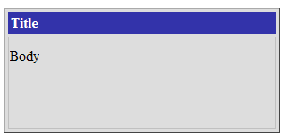
Format
<div rcf:type="IBPMPanel" ... >
    HTML element
</div>
Point
You can specify HTML elements and UI widgets in child elements. These widgets are used as contents of the body part.
Properties
The meaning of the column headers is explained in Properties topic of the section 4.2.1.1 Text.
Name | Data Type | Description | Required | Default Value |
|---|---|---|---|---|
label | String | Specifies the label text for the title part. If you specify a UDA to the id property, this property is overwritten by the UDA value when the widget is initialized. | No | "" |
You can also specify common properties for widgets. Refer to4.2.4 Common Properties for Screen Widgets.
Style Properties
Part Name | Prefix | Class Name | Available Styles |
|---|---|---|---|
Whole widget | None | rcf-Panel |
|
title part | title | rcf-Panel-title |
|
body part | body | rcf-Panel-body |
|
(*) The default width is 300px.
Refer to 4.2.5 Style Properties for details.
Additional Notes
About Panel size
The width and height is specified in the style properties. It may not be displayed correctly if the width and height are specified in CSS.
The width and height are specified in pixel units ("px"). If you use any other units for these settings, widgets may not be correctly displayed.
The minimum size for elements in the body part is 100px x 100px. If you attempt to specify a smaller size, 100px x 100px is set.
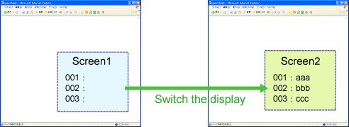
ViewStack is the widget for grouping interchangeable screen information (container). ViewStack is used to switch between containers in the same location.
You can use ViewContainer or FragmentContainer for the container. Describe the information (HTML content) of each screen as child elements of the container.
Figure 4.6 Behavior of ViewStack
Format
<div rcf:type="IBPMViewStack" ... >
  <div rcf:type="IBPMViewContainer">
    HTML element
  </div>
  <div rcf:type="IBPMFragmentContainer" rcf:src="about:blank">
  </div>
  ...
</div>
Point
You have to define at least one child element.
You can define ViewContainer or FragmentContainer in the child element.
If you define anything other than ViewContainer or FragmentContainer in the child element, it cannot be displayed.
Properties
The meaning of the column headers is explained in Properties topic of the section 4.2.1.1 Text.
Name | Data Type | Description | Required | Default Value |
|---|---|---|---|---|
selectedIndex | Number | Specifies the selected index by default. If you specify a UDA to the id property, this property is overwritten by the UDA value when the widget is initialized. | No | 0 |
selectedIndexLock | - | Cannot be specified in Systemwalker Runbook Automation Studio. | - | - |
You can also specify common properties for widgets. Refer to4.2.4 Common Properties for Screen Widgets.
Style Properties
Part Name | Prefix | Class Name | Available Styles |
|---|---|---|---|
Whole widget | None | rcf-ViewStack |
|
Refer to 4.2.5 Style Properties for details.
Additional Notes
If the size of the content to display in the ViewStack widget (including the title part) exceeds the size of the whole widget, the widget may not be displayed correctly. In such a case, set the size of the whole widget so that it is large enough for all content.
TabPanel is the widget for grouping tab-switched screen information (container). TabPanel is used to switch the display by clicking tabs.
When the tab or a form widget in this widget is focused, you can switch tabs by keyboard operation. You can also customize keys for tab switching.
Sample Display
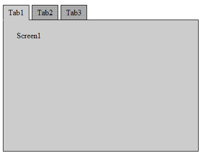
Format
<div rcf:type="IBPMTabPanel" ... >
  <div rcf:type="IBPMViewContainer" rcf:label="tab 1">
    HTML element
  </div>
  <div rcf:type="IBPMFragmentContainer" rcf:label="tab 2" ... >
  </div>
  ...
</div>
Point
You have to define at least one child element.
You can define ViewContainer or FragmentContainer in the child element.
If you define anything other than ViewContainer or FragmentContainer in the child element, it cannot be displayed.
Properties
The meaning of the column headers is explained in Properties topic of the section 4.2.1.1 Text.
Name | Data Type | Description | Required | Default Value |
|---|---|---|---|---|
selectedIndex | Number | Specifies the selected index by default. If you specify a UDA to the id property, this property is overwritten by the UDA value when the widget is initialized. | No | 0 |
String | Specifies the tab location. | No | TOP_LEFT | |
nextKey | String | Specifies the key for switching to the next tab. | No | Ctrl+right cursor key |
previousKey | String | Specifies the key for switching to the previous tab. | No | Ctrl+left cursor key |
tabSeparator | Boolean | Specifies whether or not to leave a gap between tabs.
| No | true |
tabRenderer | - | Cannot be specified in Systemwalker Runbook Automation Studio. | - | - |
tabIndex | Number | Specifies the tab order when moving the focus with the Tab key. | No | 0 |
selectedIndexLock | Boolean | Specifies whether or not the switching view is locked.
| No | false |
You can also specify ViewContainer properties. Refer to Properties in 4.2.2.1 ViewContainer for details.
You can also specify common properties for widgets. Refer to 4.2.4 Common Properties for Screen Widgets for details.
Using the tabPosition property, you can specify the location of the first tab and the direction in which subsequent tabs are located.
This property is not case-sensitive.
In the diagram below, the blue dotted lines represent the direction in which subsequent tabs are located.
Regardless of the direction of tabs, the text in the tab label always runs from left to right.
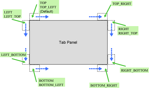
Using the nextKey property and previousKey property, you can specify a key to switch the selected tab.
You can specify the following keys separated by a plus sign ( + ):
Number or alias: Key code
ALT: Alt key
CTRL: Ctrl key
SHIFT: Shift key
The key code is required, and must be specified first.
The table below contains examples.
Example | Description |
|---|---|
13 | Enter key |
13 + SHIFT | Enter key + Shift key |
13 + CTRL + SHIFT | Enter key + Ctrl key + Shift key |
SHIFT | Invalid (no key code) |
CTRL+13 | Invalid (key code is not specified first) |
You can specify the key code number or the alias listed in the table below. The resulting behavior is the same.
For example, "ENTER+SHIFT" is handled in the same way as "13+SHIFT".
Alias | Label on Key | Actual Key Code |
|---|---|---|
BACKSPACE | Backspace key | 8 |
TAB | Tab key | 9 |
ENTER | Enter key | 13 |
ESC | Esc key | 27 |
SPACE | Space key | 32 |
PAGEUP | Page Up key | 33 |
PAGEDOWN | Page Down key | 34 |
END | End key | 35 |
HOME | Home key | 36 |
LEFT | Left cursor key | 37 |
UP | Up cursor key | 38 |
RIGHT | Right cursor key | 39 |
DOWN | Down cursor key | 40 |
INSERT | Insert key | 45 |
DELETE | Delete key | 46 |
F1 | F1 key | 112 |
F2 | F2 key | 113 |
F3 | F3 key | 114 |
F4 | F4 key | 115 |
F5 | F5 key | 116 |
F6 | F6 key | 117 |
F7 | F7 key | 118 |
F8 | F8 key | 119 |
F9 | F9 key | 120 |
F10 | F10 key | 121 |
F11 | F11 key | 122 |
F12 | F12 key | 123 |
Style Properties
Specify the TabPanel width and height using the height and width properties. Each property includes the tab height (width).
By default, the width is 100% and the height is auto.
When the height is auto, the tab panel height is changed to match the height of ViewContainer or FragmentContainer displayed in the panel.
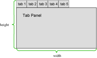
Regardless of the tab location, the default value of the headerWidth and headerHeight properties is auto.
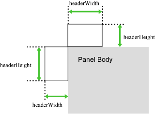
If tabs are placed on the left or right side, the tab width depends on the length of the longest tab label.
If tabs are placed at the top or bottom, the tab width is individually different depending on the length of each tab label.
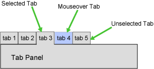
The description figure is shown below.
Part Name | Prefix | Class Name | Style Classification | Description |
|---|---|---|---|---|
Whole widget | none | rcf-TabPanel |
| Size of whole widget |
Header | header | rcf-TabPanel-header |
| Size of tab part |
Body | body | rcf-TabPanel-body |
| Body part |
Tab | tab | rcf-TabPanel-tab |
| Individual tab style |
Selected tab | tabSelected | rcf-TabPanel-tabSelected |
| Selected tab style |
Mouseover tab | tabHovered | rcf-TabPanel-tabHovered |
| Mouseover tab style |
Separator | tabSeparator | rcf-TabPanel-tabSeparator |
| Distance between tabs |
Blank | tabBlank | rcf-TabPanel-tabBlank |
| Tabbed side style except tab header |
Refer to 4.2.5 Style Properties for details.
When the selected tab and mouseover tab overlap, the order in the tab style class is tabSelected, tabHovered.
tab, tabSelected, tabHovered, tabSeparator, and tabBlank can only be specified in CSS.
The default style settings of the body and tab are different depending on whether tabs are placed. The default style settings are as follows:
Body
Tabbed side
border-style: none
Untabbed sides
border-style: solid
Tab
All sides
border-color: #000
However, if the tab is selected and the mouse is not over the tab, the border color of the tab on the side adjoining the body is the same as the tab background-color.
This behavior is the same if you customize the background color.
Additional Notes
The size properties are specified in pixel units ("px"). This is also the same for border width, margins and padding. If you use any other units for these settings, widgets may not be correctly displayed.
If the size of the content to display in the TabPanel widget (including the title part) exceeds the size of the whole widget, the widget may not be displayed correctly. In such a case, set the size of the whole widget so that it is large enough for all content.
When the TabPanel is focused using the Tab key, the focus shifts to the header part. The behavior is the same if tabs are switched using keys specified in the nextKey and previousKey properties.
When the header part is focused, the whole header part is focused, not just the header part of an individual tab.
When a widget in the body is focused, it is possible to switch tabs using keys specified in the nextKey and previousKey properties, but when the focus shifts using the Tab key, not the TabPanel but the widget itself is targeted.
If you specify a global event control key as a tab switching key, tabs may not switch correctly. For this reason, do not specify global event control keys as tab switching keys.
If you specify a browser shortcut key as a tab switching key, tab switching takes precedence and so the shortcut key process may be cancelled. For this reason, do not specify important shortcut keys as tab switching keys.
Example:
If you specify "66+CTRL(Ctrl + B) " as a tab switching key, and press Ctrl + B to execute a widget function. You cannot use Ctrl + B to open "Organize Favorites" in Internet Explorer.
FragmentContainer is the widget for specifying screen information (container) in a separate file.
Whereas ViewContainer describes HTML elements as child elements in the same file, FragmentContainer describes HTML elements in a separate file.
Data of HTML in FragmentContainer (referred to hereafter as Fragment HTML) is retrieved by asynchronous communication. Note that Fragment HTML does not conform to a DTD as simple HTML.
Retrieved Fragment HTML are inserted into HTML with FragmentContainer (referred to hereafter as Container HTML), and then the data is reflected.
Examples:
To improve the speed of initialization
Use with TabPanel or ViewStack to enable delay loading of container content.
To disperse development
Because development resources (files) are divided, development can be dispersed.
Format
<div rcf:type="IBPMFragmentContainer" rcf:src="about:blank" ... ></div>
Note
You cannot specify child elements. Refer to 4.4.1.4 Behavior when child elements are specified for widgets that cannot contain child elements for details.
Figure 4.7 FragmentContainer in Use
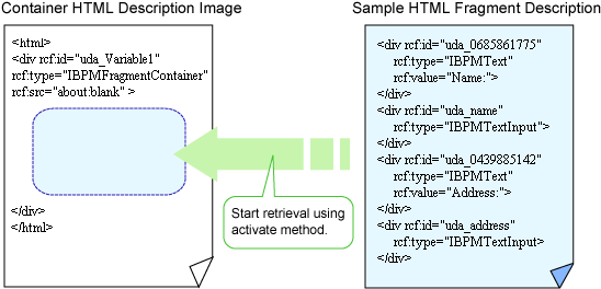
As with ordinary HTML, Fragment HTML can use UI widgets.
Properties
The meaning of the column headers is explained in Properties topic of the section 4.2.1.1 Text.
Name | Data Type | Description | Required | Default Value |
|---|---|---|---|---|
src | String | In Systemwalker Runbook Automation Studio, specify "about:blank". You have to specify a UDA to the id property to define the URL of Fragment HTML. | Yes | - |
showStatus | Boolean | Specifies whether or not the FragmentContainer status before activate (such as Initialized, Loading, and Error) is displayed.
| No | true |
statusIconImage | - | Cannot be specified in Systemwalker Runbook Automation Studio. | - | - |
timeout | Number | Specifies the timeout period for retrieving Fragment HTML. The units are milliseconds. | No | 60000(60 seconds) |
You can also specify ViewContainer properties. Refer to Properties in 4.2.2.1 ViewContainer for details.
You can also specify common properties for widgets. Refer to 4.2.4 Common Properties for Screen Widgets for details.
Style Properties
Part Name | Prefix | Class Name | Available Styles |
|---|---|---|---|
Whole widget | None | rcf-FragmentContainer |
|
Refer to 4.2.5 Style Properties for details.
Additional Notes
FragmentContainer is used in ViewStack and TabPanel to specify views.
If FragmentContainer is used without ViewStack or TabPanel, it is displayed in the same way as an ordinary <div> tag.
Fragment HTML are added to the HTML body. For this reason, you cannot define HTML header elements in Fragment HTML.
Before assigning the UDA value to FragmentContainer, the value is first encoded and then assigned.
For FragmentContainer, you should not change the rcf:src="about:blank" during design time. If you change the value of src property, one of the following messages is displayed:
Object expected.
'excArrayObj' is undefined.
Note
You can add only a widget of Advanced Category to a Fragment HTML.You cannot add a widget of Basic Category to a Fragment HTML.
If you use a Fragment HTML, you have to do the following operations.
Create a file by the QuickForm Wizard Dialog (execute New > QuickForm command).
-> An Ajax Page Editor is displayed.
Delete lines other than the following lines in the Source View of the Ajax Page Editor.
<script type="text/javascript" src="../rcf_config.js" charset="UTF-8"></script>
<script type="text/javascript" src="../acf/file/rcf/rcf.js" charset="UTF-8"></script>
<body>
</body>
The content of edited file (jsp) is the following.
<script type="text/javascript" src="../rcf_config.js" charset="UTF-8"></script>
<script type="text/javascript" src="../acf/file/rcf/rcf.js" charset="UTF-8"></script>
<body>
</body>
Put UI widget by using Ajax page editor.
The content of file (jsp) that is added the UI widget is the following.
<script type="text/javascript" src="../rcf_config.js" charset="UTF-8"></script>
<script type="text/javascript" src="../acf/file/rcf/rcf.js" charset="UTF-8"></script>
<body>

<div rcf:id="uda_1883781543" rcf:type="IBPMText" rcf:value="Text" style="left: 33px; top: 29px; position: absolute"></div>
<div style="position: absolute; width: 188px; height: 78px; left: 68px; top: 17px">
    <div rcf:id="uda_1515456276" rcf:type="IBPMTextInput" rcf:width="155px" rcf:height="20px" style="left: 12px; top: 12px; position: absolute"></div>
    <div rcf:id="error_1515456276" rcf:type="IBPMText" rcf:value="                                        " rcf:color="#FF0000" rcf:width="155px" rcf:height="20px" style="left: 14px; top: 46px; position: absolute"></div>
</div>
</body>
The screen image is the following.
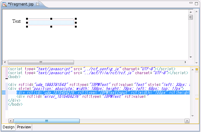
Delete description other than added UI widget. Execute upload and export of the application under this condition. The content of edited file (jsp) is the following.
<div rcf:id="uda_1883781543" rcf:type="IBPMText" rcf:value="Text" style="left: 33px; top: 29px; position: absolute"></div>
<div style="position: absolute; width: 188px; height: 78px; left: 68px; top: 17px">
    <div rcf:id="uda_1515456276" rcf:type="IBPMTextInput" rcf:width="155px" rcf:height="20px" style="left: 12px; top: 12px; position: absolute"></div>
    <div rcf:id="error_1515456276" rcf:type="IBPMText" rcf:value="                                        " rcf:color="#FF0000" rcf:width="155px" rcf:height="20px" style="left: 14px; top: 46px; position: absolute"></div>
</div>
When you edit fragment HTML again, rewrite the deleted description (underlined part).
<script type="text/javascript" src="../rcf_config.js" charset="UTF-8"></script>
<script type="text/javascript" src="../acf/file/rcf/rcf.js" charset="UTF-8"></script>
<body>
<div rcf:id="uda_1883781543" rcf:type="IBPMText" rcf:value="Text" style="left: 33px; top: 29px; position: absolute"></div>
<div style="position: absolute; width: 188px; height: 78px; left: 68px; top: 17px">
    <div rcf:id="uda_1515456276" rcf:type="IBPMTextInput" rcf:width="155px" rcf:height="20px" style="left: 12px; top: 12px; position: absolute"></div>
    <div rcf:id="error_1515456276" rcf:type="IBPMText" rcf:value="                                        " rcf:color="#FF0000" rcf:width="155px" rcf:height="20px" style="left: 14px; top: 46px; position: absolute"></div>
</div>
</body>