Form widgets are widgets mainly for allowing users to enter data, for example text boxes, radio buttons, etc.
This section explains how to use form widgets.
Text is the widget to display text.
Sample Display
![]()
Format
<div rcf:type="IBPMText" ... ></div>
Or
<span rcf:type="IBPMText" ... ></span>
Note
You cannot specify child elements. Refer to 4.4.1.4 Behavior when child elements are specified for widgets that cannot contain child elements or details.
Point
This widget is displayed in the following way:
Using with <div> tag, line feed is inserted before and after the widget.
Using with <span> tag, line feed is not inserted before and after the widget.
Properties
The meaning of the column headers is as follows:
Required: Whether or not the property is a required setting.
Default Value: The value assumed if the property is not set.
Name | Data Type | Description | Required | Default Value |
|---|---|---|---|---|
value | String | Specifies text. If you specify a UDA to the id property, this property is overwritten by the UDA value when the widget is initialized. | No | "" |
title | String | Specifies the text to be displayed in the tooltip. | No | "" |
labelProvider | - | Cannot be specified in Systemwalker Runbook Automation Studio. | - | - |
You can also specify common properties for widgets. Refer to 4.2.4 Common Properties for Screen Widgets for details.
Note
If you specified a long character string to the title property, it is automatically wrapped or cut out.
When you display text which includes special characters, you must replace special character by escape character.
The correspondence table are as follows:
special character | escape character |
|---|---|
& | & |
< | < |
> | > |
" | " |
' | ' |
Line feed character | |
Space (single-byte space or tab) | |
Example: In the case of the character string <formatted"text">,you specify the text to property of UDA as follows:
[Before Conversion]
      <formatted"text">
     (1)       (2)  (2)(3)
[After Conversion]
<formatted"text">
(1) (2) (2) (3)If you specify the special character to property by mistake,you remove the character.
Then if QuickForm doesn't work correctly, you should check the property in the Source View.
Style Properties
Part Name | Prefix | Class Name | Available Styles |
|---|---|---|---|
Whole widget | None | rcf-Text |
|
Refer to 4.2.5 Style Properties for details.
Note
Notes on borders
When a border is specified in Text, it may be incorrectly displayed as in the illustration below.
![]()
This can be avoided by using one of the following ways:
Adding an empty line under the Text widget
<div rcf:type="IBPMText" rcf:value="character string"></div> <br/>
Specifying the position:relative style attribute in <div> or <span> tag for Text widget
<div rcf:type="IBPMText" style="position:relative" rcf:value="character string"></div>
TextInput is the widget to input and edit a single line of text.
Sample Display
![]()
You can undo using Ctrl+Z. Refer to 4.4.1.7 Undo Using Ctrl+z in Text Input Widgets for details.
Format
<div rcf:type="IBPMTextInput" ... ></div>
Or
<span rcf:type="IBPMTextInput" ... ></span>
Note
You cannot specify child elements. Refer to 4.4.1.4 Behavior when child elements are specified for widgets that cannot contain child elements for details.
Point
This widget is displayed in the following way:
Using with <div> tag, line feed is inserted before and after the widget.
Using with <span> tag, line feed is not inserted before and after the widget.
Properties
The meaning of the column headers is explained in Properties topic of the section 4.2.1.1 Text.
Name | Data Type | Description | Required | Default Value |
|---|---|---|---|---|
value | String | Specifies text. If you specify a UDA to the id property, this property is overwritten by the UDA value when the widget is initialized. Refer to 4.2.4 Common Properties for Screen Widgets for information on how to specify a UDA. | No | "" |
title | String | Specifies the text to be displayed in the tooltip. | No | "" |
labelProvider | - | Cannot be specified in Systemwalker Runbook Automation Studio. | - | - |
enabled | Boolean | Specifies whether or not this widget is enabled.
| No | true |
readOnly | Boolean | Specifies whether or not this widget is read-only.
| No | false |
password | Boolean | Specifies whether or not password input is required.
| No | false |
maxLength | Number | Specifies the maximum text length.
| No | None (-1) |
autoEscape | - | Cannot be specified in Systemwalker Runbook Automation Studio. | - | - |
tabIndex | Number | Specifies the tab order when moving the focus with the Tab key. | No | 0 |
uppercase | Boolean | Specifies whether or not single-byte and double-byte alphanumeric characters are converted to uppercase.
| No | false |
imeMode | String |
| No | auto |
mandatory | Boolean | Specifies whether or not the entered value is required.
| No | false |
You can also specify common properties for widgets. Refer to 4.2.4 Common Properties for Screen Widgets for details.
Note
If you specified a long character string to the title property, it is automatically wrapped or cut out.
Style Properties
Part Name | Prefix | Class Name | Available Styles |
|---|---|---|---|
Whole widget | None | rcf-IBPMTextInput |
|
Refer to 4.2.5 Style Properties for details.
CheckBox is the widget to display a check box.
Sample Display
![]()
Format
<div rcf:type="IBPMCheckBox" ... ></div>
Or
<span rcf:type="IBPMCheckBox" ... ></span>
Note
You cannot specify child elements. Refer to 4.4.1.4 Behavior when child elements are specified for widgets that cannot contain child elements for details.
Point
This widget is displayed in the following way:
Using with <div> tag, line feed is inserted before and after the widget.
Using with <span> tag, line feed is not inserted before and after the widget.
Properties
The meaning of the column headers is explained in Properties topic of the section 4.2.1.1 Text.
Name | Data Type | Description | Required | Default Value |
|---|---|---|---|---|
value | String | Specifies the value of the check box. | No | "" |
checked | Boolean | Specifies whether or not the button is checked.
If you specify a UDA to the id property, this property is overwritten by the UDA value when the widget is initialized and the value of the check box is saved to the UDA value.
| No | false |
title | String | Specifies the text to be displayed in the tooltip. If an empty string is specified, the tooltip is not displayed. | No | "" |
label | String | Specifies the label text for the check box. | No | "" |
enabled | Boolean | Specifies whether or not this widget is enabled.
| No | true |
tabIndex | Number | Specifies the tab order when moving the focus with the Tab key. | No | 0 |
You can also specify common properties for widgets. Refer to 4.2.4 Common Properties for Screen Widgets for details.
Note
Notes on using the title property
If you specified a long character string to the title property, it is automatically wrapped or cut out.
Notes on using the label property
If you specified a long character string whose width is greater than the CheckBox width to the label property, it is wrapped by default.
Style Properties
The style properties are shown below.
Part Name | Prefix | Class Name | Available Styles |
|---|---|---|---|
Whole widget | None | rcf-CheckBox |
|
Label | label | rcf-CheckBox-label |
|
Figure 4.1 Structure of CheckBox Widget
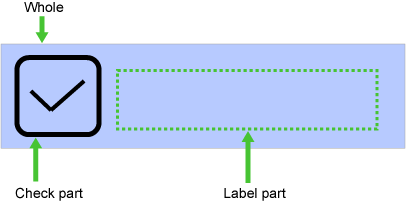
Refer to 4.2.5 Style Properties for details.
RadioButton is the widget for displaying a radio button.
Point
You can use this with RadioButtonGroup to group radio buttons that are mutually exclusive.
Sample Display
![]()
Format
<div rcf:type="IBPMRadioButton" ... ></div>
Or
<span rcf:type="IBPMRadioButton" ... ></span>
Note
You cannot specify child elements. Refer to 4.4.1.4 Behavior when child elements are specified for widgets that cannot contain child elements for details.
Point
This widget is displayed in the following way:
Using with <div> tag, line feed is inserted before and after the widget.
Using with <span> tag, line feed is not inserted before and after the widget.
Properties
The meaning of the column headers is explained in Properties topic of the section 4.2.1.1 Text.
Name | Data Type | Description | Required | Default Value |
|---|---|---|---|---|
value | String | Specifies the value of the radio button. | No | "" |
checked | Boolean | Specifies whether or not the radio button is selected.
If you specify a UDA to the id property, this property is overwritten by the UDA value when the widget is initialized. And the value of the radio button is saved to the UDA value. Refer to 4.2.4 Common Properties for Screen Widgets for information on how to specify a UDA. | No | false |
title | String | Specifies the text to be displayed in the tooltip. If an empty string is specified, the tooltip is not displayed. | No | "" |
label | String | Specifies the label text for the radio button. | No | "" |
enabled | Boolean | Specifies whether or not this widget is enabled.
| No | true |
tabIndex | Number | Specifies the tab order when moving the focus with the Tab key. | No | 0 |
You can also specify common properties for widgets. Refer to 4.2.4 Common Properties for Screen Widgets for details.
Note
Notes on using the title property
If you specified a long character string to the title property, it is automatically wrapped or cut out.
Notes on using the label property
If you specified a long character string whose width is greater than the RadioButton width to the label property, it is wrapped by default.
Style Properties
The style properties are shown below.
Part Name | Prefix | Class Name | Available Styles |
|---|---|---|---|
Whole widget | None | rcf-RadioButton |
|
Label | label | rcf-RadioButton-label |
|
Figure 4.2 Structure of RadioButton Widget
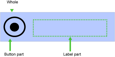
Refer to 4.2.5 Style Properties for details.
Note
To relate the selective state of two or more RadioButton in one UDA, combine with the Java action (evaluation of Script).
The following three UDA is used in this example.
lang:[DataType(STRING)]: This is UDA to describe the selective state of two RadioBotton.
lang_en:[DataType(STRING)]: This is UDA to describe RadioBotton "English".
lang_jp:[DataType(STRING)]: This is UDA to describe RadioBotton "Japanese".
![]()
<div rcf:id="uda_0744236677" rcf:type="IBPMText" rcf:value="Language:" style="left: 31px; top: 30px; position: absolute"></div>

<div rcf:id="uda_lang_en" rcf:type="IBPMRadioButton" rcf:value="English" rcf:label="English" rcf:width="100px" rcf:height="20px" style="left: 104px; top: 29px; position: absolute"></div>
<div rcf:id="uda_lang_jp" rcf:type="IBPMRadioButton" rcf:value="Japanese" rcf:label="Japanese" rcf:width="100px" rcf:height="20px" style="left: 190px; top: 29px; position: absolute"></div>
<div rcf:type="RadioButtonGroup" rcf:targets="uda_lang_en;uda_lang_jp"></div>
Note: Two radiobuttons should be made a group with RadioButtonGroup. For more information about RadioButtonGroup, refer to 4.3.1 Grouping Functions.
Add the end action (evaluation of script) to the Activity node that added QuickForm, and describe the script field as follows.
if (uda.get("jang_en") == "true") {
    uda.set("lang", "English");
} else if (uda.get("lang_jp") == "true") {
    uda.set("lang", "Japanese");
}
In this example, "true" is set to UDA(lang_en) when English is selected, and when Japanese is selected, "True" is set to UDA(lang_jp). In the end action of the Activity node, if the value of UDA(lang_en) is "true", "English" which means the Radiobutton(English) is selected is stored in UDA(lang), and if value of UDA(lang_jp) is "true", "Japanese" which means the Radiobutton(Japanese) is selected is stored in UDA(lang).
TextArea is the widget to display an input field for one or more lines of text.
Note
About line feed code
If the character string entered in TextArea contains a line feed, it is represented in the character string value of the value property as "\n"(LF, character code 10).
Sample Display

You can undo using Ctrl+Z. Refer to 4.4.1.7 Undo Using Ctrl+z in Text Input Widgets for details.
Format
<div rcf:type="IBPMTextArea" ... ></div>
Or
<span rcf:type="IBPMTextArea" ... ></span>
Note
You cannot specify child elements. Refer to 4.4.1.4 Behavior when child elements are specified for widgets that cannot contain child elements for details.
Point
This widget is displayed in the following way:
Using with <div> tag, line feed is inserted before and after the widget.
Using with <span> tag, line feed is not inserted before and after the widget.
Properties
The meaning of the column headers is explained in Properties topic of the section 4.2.1.1 Text.
Name | Data Type | Description | Required | Default Value |
|---|---|---|---|---|
value | String | Specifies text. Refer to 4.2.4 Common Properties for Screen Widgets for information on how to specify a UDA. | No | "" |
title | String | Specifies the text to be displayed in the tooltip. If an empty string is specified, the tooltip is not displayed. | No | "" |
labelProvider | - | Cannot be specified in Systemwalker Runbook Automation Studio. | - | - |
enabled | Boolean | Specifies whether or not this widget is enabled.
| No | true |
readOnly | Boolean | Specifies whether or not this widget is read-only.
| No | false |
rows | Number | Specifies the number of rows. You can specify an integer greater than or equal to 1. | No | 2 |
cols | Number | Specifies the number of characters the TextArea can contain, taking into account the average character width. You can specify values of 1 or more. | No | 20 |
tabIndex | Number | Specifies the tab order when moving the focus with the Tab key. | No | 0 |
imeMode | - | Cannot be specified in Systemwalker Runbook Automation Studio. | - | - |
mandatory | Boolean | Specifies whether or not the entered value is required.
| No | false |
You can also specify common properties for widgets. Refer to 4.2.4 Common Properties for Screen Widgets for details.
Note
If you specified a long character string to the title property, it is automatically wrapped or cut out.
Style Properties
Part Name | Prefix | Class Name | Available Styles |
|---|---|---|---|
Whole widget | None | rcf-TextArea |
|
Refer to 4.2.5 Style Properties for details.
Select is the widget to display a list box from which single or multiple items can be selected.
Sample Display

Format
<div rcf:type="IBPMSelect" ... ></div>
Or
<span rcf:type="IBPMSelect" ... ></span>
Note
You cannot specify child elements. Refer to 4.4.1.4 Behavior when child elements are specified for widgets that cannot contain child elements for details.
Point
This widget is displayed in the following way:
Using with <div> tag, line feed is inserted before and after the widget.
Using with <span> tag, line feed is not inserted before and after the widget.
Properties
The meaning of the column headers is explained in Properties topic of the section 4.2.1.1 Text.
Name | Data Type | Description | Required | Default Value |
|---|---|---|---|---|
options | String Array | Specifies the available options in the list. If you specify a UDA to the prop_options property, this property is overwritten by the UDA value when the widget is initialized. | It is necessary to set the value of either the options property or the prop_options property. | [] |
prop_options | String | Specifies a String type UDA in specific format.
Refer to 4.2.4 Common Properties for Screen Widgets for information on how to specify a UDA. | "" | |
multiple | Boolean | Specifies whether or not multiple options can be selected.
| No | false |
selectedIndex | Number | In case of single selection,
In case of multiple selections,
| No | -1 |
selectedIndexes | Number Array | Specifies an array of selected indexes (starting from zero). Indexes are stored in the order in which items are selected. If you specify a UDA to the id property, this property is overwritten by the value depending on the UDA value when the widget is initialized; and values depending on selected indexes are saved to the UDA value in comma separated format.
| No | [] |
selectedValue | String | In case of single selection,
In case of multiple selections,
| No | "" |
selectedValues | String Array | Specifies a value array of the selected items. Values are stored in the order in which items are selected. | No | [] |
size | Number | Specifies the height (the number of rows) of the selection list. | No | (Set automatically) |
title | String | Specifies the text to be displayed in the tooltip. If an empty string is specified, the tooltip is not displayed. | No | "" |
enabled | Boolean | Specifies whether or not this widget is enabled.
| No | true |
tabIndex | Number | Specifies the tab order when moving the focus with the Tab key. | No | 0 |
mandatory | Boolean | Specifies whether or not the entered value is required.
| No | false |
You can also specify common properties for widgets. Refer to 4.2.4 Common Properties for Screen Widgets for details.
Note
If you specify the prop_options property to relate to a UDA, the available options cannot contain commas since commas are used to separate options.
If you specified a long character string to the title property, it is automatically wrapped or cut out.
The behavior of the following properties is different depending on the value of the 'multiple' property:
selectedIndex
selectedIndexes
selectedValue
selectedValues
As a rule, you have to use these properties as follows:
In case of single selection (multiple=false)
selectedIndex
selectedValue
If selectedIndex and selectedValue are specified together, selectedIndex takes precedence.
In case of multiple selections (multiple=true)
selectedIndexes
selectedValues
If selectedIndexes and selectedValues are specified together, selectedIndexes takes precedence.
Style Properties
Part Name | Prefix | Class Name | Available Styles |
|---|---|---|---|
Whole widget | None | rcf-Select |
|
Refer to 4.2.5 Style Properties for details.
Additional Notes
About multiple selections
The operations for making multiple selections using the keyboard keys and the mouse are as follows by default:
To add or cancel individual selections,
Click an item while pressing the Ctrl key
To select an area,
Press the cursor key while pressing the Shift key
Drag the mouse
ComboBox is the widget for displaying a combo box, which consists of an input field and a list of items from which a single item can be selected.
Sample Display
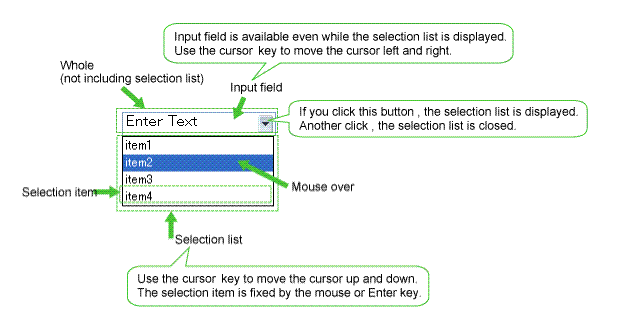
You can undo using Ctrl+Z. Refer to 4.4.1.7 Undo Using Ctrl+z in Text Input Widgets for details.
Note
In cases where you place a ComboBox at the bottom of a form, or you set a large number of selection items in the list without setting the height for the widget, the ComboBox may not fit inside the form boundaries.
If this happens, depending on the browser, the user cannot see the entire list and the only way for the user to make selections is by using the keyboard.
For this reason, always make sure that the ComboBox widget is set to fit completely inside the form boundaries.
Format
<div rcf:type="IBPMComboBox" ... ></div>
Note
You cannot specify child elements. Refer to 4.4.1.4 Behavior when child elements are specified for widgets that cannot contain child elements for details.
Point
Line feed is inserted before and after the widget.
Properties
The meaning of the column headers is explained in Properties topic of the section 4.2.1.1 Text.
Name | Data Type | Description | Required | Default Value |
|---|---|---|---|---|
list | String Array | Specifies the values of items to display in the list. If you specify a UDA to the prop_list property, this property is overwritten by the UDA value when the widget is initialized. | It is necessary to set the value of either the list property or the prop_list property. | [] |
prop_list | String | Specifies a String type UDA in specific format. This UDA value has the available options which are separated by comma. Refer to 4.2.4 Common Properties for Screen Widgets for information on how to specify a UDA. | "" | |
buttonImage | - | Cannot be specified in Systemwalker Runbook Automation Studio. | - | - |
fixButtonImageSize | Boolean | Specifies whether or not the size of the drop down button image is fixed.
Refer to Example for fixButtonImageSize property for details. | No | false |
buttonImageSize | - | Cannot be specified in Systemwalker Runbook Automation Studio. | - | - |
mandatory | Boolean | Specifies whether or not the entered value is required.
| No | false |
You can also specify TextInput properties. Refer to Properties in 4.2.1.2 TextInput for details.
You can also specify common properties for widgets. Refer to 4.2.4 Common Properties for Screen Widgets for details.
Note
If you specify the prop_list property to relate to a UDA, the available options cannot contain commas since commas are used to separate options.
If you specified a long character string to the title property, it is automatically wrapped or cut out.
Point
If the maxLength property is specified, character strings in the selection list must be no longer than the maximum number of characters specified in maxLength.
If the value of the uppercase property is "true", letters of the Roman alphabet in the selection list are converted to uppercase for display.
The size of the drop down button image is different depending on the fixButtonImageSize property.
fixButtonImageSize=false
If you change the width style property and the height style property, the size of the dropdown button image (in pixels) is changed as follows:
Width: width/10(omit decimals) px
Height: height-2 px
![]()
fixButtonImageSize=true
If you change the width style property and the height style property, the size of the drop-down button image (in pixels) is not changed.
![]()
Style Properties
Part Name | Prefix | Class Name | Available Styles |
|---|---|---|---|
Whole widget | None | rcf-ComboBox |
|
Input field | input | rcf-ComboBox-input |
|
Selection list | list | rcf-ComboBox-list |
|
Selection item without the cursor | item | rcf-ComboBox-item |
|
Selection item with the cursor | itemHovered | rcf-ComboBox-itemHovered |
|
Refer to 4.2.5 Style Properties for details.
Additional Notes
About combo box size:
The height and width of the widget are specified in pixel units ("px"). If you use any other units for these settings, widgets may not be correctly displayed.
Selecting value from a list:
When you use the mouse to display the list, you cannot drag the mouse over items in the list in the same movement in order to select an item. After displaying the list, you must click the item once more to select it.
DateInput is the widget to input and edit the date.
Sample Display
![]()
You can undo using Ctrl+Z. Refer to 4.4.1.7 Undo Using Ctrl+z in Text Input Widgets for details.
Format
<div rcf:type="IBPMDateInput" ... ></div>
Or
<span rcf:type="IBPMDateInput" ... ></span>
Note
You cannot specify child elements. Refer to 4.4.1.4 Behavior when child elements are specified for widgets that cannot contain child elements for details.
Point
This widget is displayed in the following way:
Using with <div> tag, line feed is inserted before and after the widget.
Using with <span> tag, line feed is not inserted before and after the widget.
Properties
The meaning of the column headers is explained in Properties topic of the section 4.2.1.1 Text.
Name | Data Type | Description | Required | Default Value |
|---|---|---|---|---|
date | - | Cannot be specified in Systemwalker Runbook Automation Studio. You can specify a UDA in the id property to define the date and time. The value entered in the input field is saved to the UDA value. | - | - |
utc | - | Cannot be specified in Systemwalker Runbook Automation Studio. | - | - |
converter | - | Cannot be specified in Systemwalker Runbook Automation Studio. | - | - |
refocus | Boolean | Specifies whether or not the focus is returned to the widget when the conversion from the input text into the Date object fails.
| No | false |
mandatory | Boolean | Specifies whether or not the entered value is required.
| No | false |
You can also specify TextInput properties. Refer to Properties in 4.2.1.2 TextInput.
You can also specify common properties for widgets. Refer to4.2.4 Common Properties for Screen Widgets.
Point
When you select the DateInput widget in the Palette View, and you drop this widget to the Ajax Page Editor, the following widgets are defined together.
DateInput,
PopupCalendar
CalendarButton
![]()
If you want to relate the UDA to DateInput widget, you need to define uda_+<this UDA identifier> to the following properties.
id property of DateInput.
targetDateInputId property of PopupCalendar.
When you display the calendar by clicking the calendar button, and select the date, and press the OK button, the selected date and 00:00 is set to the field of DateInput.
Note
If you specified a long character string to the title property, it is automatically wrapped or cut out. If an empty string is specified, nothing is displayed.
Input text is only converted to a JavaScript Date object when the input field loses the focus and its value is different from the previous one.
The value property cannot be specified in Systemwalker Runbook Automation Studio.
The refocus property is to get back the focus when the conversion from the input text into the Date object fails. However, it may not work correctly in the following case:
When moving the focus to area outside a page (such as the browser address bar or a toolbar). For example, when clicking the address bar or displaying the address bar dropdown list, focus may be shifted away from DateInput.
If you are using DATE UDA and enter "January 01, 1970 00:00:00" as the default value while adding the UDA, the value of date displayed in the form will be empty. If you keep DateInput control empty, the value stored in the mapped DATE type UDA will be "January 01, 1970 00:00:00".
Style Properties
The style properties for this widget are the same as for TextInput. Refer to Style Properties in 4.2.1.2 TextInput for details. However, note that the class name is "rcf-IBPMDateInput". Refer to 4.2.5 Style Properties for details.
NumberInput is the widget to display an input field for integers and real numbers.
Sample Display
![]()
You can undo using Ctrl+Z. Refer to 4.4.1.7 Undo Using Ctrl+z in Text Input Widgets for details.
Format
<div rcf:type="IBPMNumberInput" ... ></div>
Or
<span rcf:type="IBPMNumberInput" ... ></span>
Note
You cannot specify child elements. Refer to 4.4.1.4 Behavior when child elements are specified for widgets that cannot contain child elements for details.
Point
This widget is displayed in the following way:
Using with <div> tag, line feed is inserted before and after the widget.
Using with <span> tag, line feed is not inserted before and after the widget.
Properties
The meaning of the column headers is explained in Properties topic of the section 4.2.1.1 Text.
Name | Data Type | Description | Required | Default Value |
|---|---|---|---|---|
number | Number | Specifies numerical value data. If you specify a UDA to the id property, this property is overwritten by the UDA value when the widget is initialized. And the value entered in the input field is saved to the UDA value. Refer to 4.2.4 Common Properties for Screen Widgets for information on how to specify a UDA. | No | 0 |
converter | - | Cannot be specified in Systemwalker Runbook Automation Studio. | - | - |
refocus | Boolean | Specifies whether or not the focus is returned to the widget when the conversion from the input text into the Date object fails.
| No | false |
mandatory | Boolean | Specifies whether or not the entered value is required.
| No | false |
minimumValue | Number | Specifies the minimum value for the input field. | No | "" |
maximumValue | Number | Specifies the maximum value for the input field. | No | "" |
You can also specify TextInput properties. Refer to Properties in 4.2.1.2 TextInput.
You can also specify common properties for widgets. Refer to4.2.4 Common Properties for Screen Widgets.
Note
If you specified a long character string to the title property, it is automatically wrapped or cut out.
Input text is only converted to a JavaScript number object when the input field loses the focus and its value is different from the previous one.
The value property cannot be specified in Systemwalker Runbook Automation Studio.
The refocus property is function to get back the focus when the conversion from the input text into the number object fails. However, it may not work correctly in the following case:
When moving the focus to area outside a page (such as the browser address bar or a toolbar). For example, when clicking the address bar or displaying the address bar dropdown list, focus may be shifted away from NumberInput.
The value of the minimumValue property and the maximumValue property is not checked in the editor. Therefore, it is necessary to specify the following values for these properties.
Numerical value (value that can be specified with type INTEGER, LONG, FLOAT, and BIGDECIMAL of UDA)
Value that the maximum value (value of maximumValue property) becomes more than minimum value (value of minimumValue property) when the maximum value and minimum value are specified
Style Properties
The style properties for this widget are the same as for TextInput. Refer to Style Properties in 4.2.1.2 TextInput for details. However, note that the class name is "rcf-IBPMDateInput". Refer to 4.2.5 Style Properties for details.
SelectList is the widget to display a list from which single or multiple items can be selected.
Sample Display
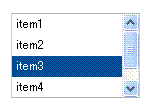
Format
<div rcf:type="IBPMSelectList" ... ></div>
Note
You cannot specify child elements. Refer to 4.4.1.4 Behavior when child elements are specified for widgets that cannot contain child elements for details.
Point
Line feed is inserted before and after the widget.
Properties
The meaning of the column headers is explained in Properties topic of the section 4.2.1.1 Text.
Name | Data Type | Description | Required | Default Value |
|---|---|---|---|---|
options | String Array | Specifies the available value options in the list. | It is necessary to set the value of either the options property or the prop_options property. | [] |
prop_options | String | Specifies a String type UDA in specific format. This UDA value has the available value options which are separated by comma. Refer to 4.2.4 Common Properties for Screen Widgets for information on how to specify a UDA. | "" | |
labelProvider | - | Cannot be specified in Systemwalker Runbook Automation Studio. | - | - |
multiple | Boolean | Specifies whether or not multiple options can be selected.
| No | false |
selectedIndex | Number | In case of single selection,
In case of multiple selections,
| No | -1 |
selectedIndexes | Number Array | Specifies an array of selected indexes (starting from zero). Indexes are stored in the order in which items are selected. | No | -1 |
title | String | Specifies the text to be displayed in the tooltip. If an empty string is specified, the tooltip is not displayed. | No | "" |
enabled | Boolean | Specifies whether or not this widget is enabled.
| No | true |
tabIndex | Number | Specifies the tab order when moving the focus with the Tab key. | No | 0 |
renderer | - | Cannot be specified in Systemwalker Runbook Automation Studio. | - | - |
mandatory | Boolean | Specifies whether or not the entered value is required.
| No | false |
You can also specify common properties for widgets. Refer to4.2.4 Common Properties for Screen Widgets.
Note
If you specify the prop_options property to relate to a UDA, the available options cannot contain commas since commas are used to separate options.
If you specified a long character string to the title property, it is automatically wrapped or cut out.
Point
In case of single selection,
Only one item can be selected at any one time. You need to use the selectedIndex property. If no value is specified, the first item in the list is selected by default.
You can change the selected item by clicking on the item.
You can use the vertical cursor key to move the selection between items.
In case of multiple selections,
You need to use the selectedIndexes property. If no value is specified, no item in the list is selected by default.
You can add selections by clicking on the item. If you click a selected item, you clear the selection.
You can use the vertical cursor key to move the focus between items (mouseover items) and the space key to select/deselect items.
Style Properties
Style properties of whole widgets are shown below.
Part Name | Prefix | Class Name | Available Styles |
|---|---|---|---|
Whole widget | None | rcf-SelectList |
|
Refer to 4.2.5 Style Properties for details.
Prefix | Class | Style Properties | Description | Default |
|---|---|---|---|---|
optionSelected | rcf-SelectList-optionSelected | backgroundColor | Specifies the background color of the selected item. | #004E98 |
color | Specifies the font color of the selected item. | #FFFFFF(white) | ||
optionHovered | rcf-SelectList-optionHovered | backgroundColor | Specifies the background color of the mouseover item. | #316AC5 |
color | Specifies the font color of the mouseover item. | #FFFFFF(white) |
The style properties for this widget are the same as for CheckList. However, no check boxes are displayed. Refer to Style Properties in 4.2.1.11 CheckList for details.
CheckList is the widget to display a list with check button items from which single or multiple items can be selected.
Sample Display
Figure 4.3 Single Selection Mode
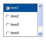
In single selection mode, radio buttons are displayed.
Figure 4.4 Multiple Selections Mode
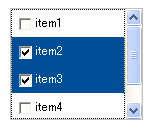
In multiple selections mode, check boxes are displayed.
Format
<div rcf:type="IBPMCheckList" ... ></div>
Note
You cannot specify child elements. Refer to 4.4.1.4 Behavior when child elements are specified for widgets that cannot contain child elements for details.
Point
Line feed is inserted before and after the widget.
Properties
The meaning of the column headers is explained in Properties topic of the section 4.2.1.1 Text.
Name | Data Type | Description | Required | Default Value |
|---|---|---|---|---|
options | Array | Specifies the available value options in the list. | It is necessary to set the value of either the options property or the prop_options property. | [] |
prop_options | String | Specifies a String type UDA in specific format. This UDA value has the available value options which are separated by comma. Refer to 4.2.4 Common Properties for Screen Widgets for information on how to specify a UDA. | "" | |
labelProvider | - | Cannot be specified in Systemwalker Runbook Automation Studio. | - | - |
multiple | Boolean | Specifies whether or not multiple options can be selected.
| No | false |
selectedIndex | Number Array | In case of single selection,
In case of multiple selections,
| No | -1 |
selectedIndexes | Number Array | Specifies an array of selected indexes (starting from zero). Indexes are stored in the order in which items are selected. | No | [] |
title | String | Specifies the text to be displayed in the tooltip. If an empty string is specified, the tooltip is not displayed. | No | "" |
enabled | Boolean | Specifies whether or not this widget is enabled.
| No | true |
tabIndex | Number | Specifies the tab order when moving the focus with the Tab key. | No | 0 |
mandatory | Boolean | Specifies whether or not the entered value is required.
| No | false |
You can also specify common properties for widgets. Refer to4.2.4 Common Properties for Screen Widgets.
Note
If you specify the prop_options property to relate to a UDA, the available options cannot contain commas since commas are used to separate options.
If you specified a long character string to the title property, it is automatically wrapped or cut out.
Point
You can specify the initial selections to the selectedIndex property. If no value is specified, no item in the list is selected by default.
In case of single selection, you can use the vertical cursor key to move the selection between items.
In case of multiple selections, you can use the vertical cursor key to move the focus between items.
Style Properties
Style properties of whole widgets are shown below.
Part Name | Prefix | Class Name | Available Styles |
|---|---|---|---|
Whole widget | None | rcf-CheckList |
|
Refer to 4.2.5 Style Properties for details.
Prefix | Class | Style Properties | Description | default |
|---|---|---|---|---|
optionSelected | rcf-CheckList-optionSelected | backgroundColor | Specifies the background color of the selected item. | #004E98 |
color | Specifies the font color of the selected item. | #FFFFFF (white) | ||
optionHovered | rcf-CheckList-optionHovered | backgroundColor | Specifies the background color of the mouseover item. | #316AC5 |
color | Specifies the font color of the mouseover item. | #FFFFFF (white) |
Figure 4.5 Relation of Display and Style Properties
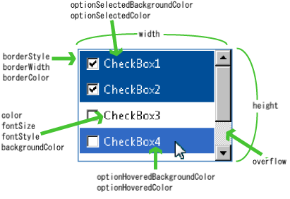
If the size of the items is too large for the display area, the widget is displayed in the following way:
If the width of item is greater than the width of the display area, item beyond the right margin is hidden. The horizontal scrollbar is not displayed.
If the height of items is greater than the height of the display area, the vertical scrollbar is displayed to allow users to view all items.
Additional Notes
Moving the focus with the Tab key
In case of single selection, the focus is moved to the radio button within the widget when you press the Tab key to move the focus.
To move the focus to the next widget, press the Tab key again.