The tree format Bean has the following information and Customizer functions.
See
"Package Guide"- JFTree
Property information
Name | Type | Reference | Setting | Explanation |
|---|---|---|---|---|
background | java.awt | Y | Y | Background color |
borderColor | java.awt | Y | Y | Border line color |
borderType | int | Y | Y | Border line type |
borderWidth | int | Y | Y | Border line width |
closedImage | java.awt | Y | Closed icon image | |
columnCount | int | Y | Y | Number of data columns |
columnWidth | com.fujitsu.jbk.gui | Y | Width of the specified column | |
columns | int | Y | Y | Number of display columns |
componentOrientation | java.awt | Y | Y | The orientation of the string. It depends on the language |
controlDraw | boolean | Y | Y | Whether to control drawing |
doubleClickOpen | boolean | Y | Y | Whether to open and close by double-clicking |
editable | boolean | Y | Y | Editing enabled/disabled |
enableChangeWidth | com.fujitsu.jbk.gui | Y | Changing of the display width of the specified column enabled/disabled | |
enableMenu | boolean | Y | Y | Whether to display the popup menu |
enableSort | com.fujitsu.jbk.gui | Y | Sorting with the specified column data as key enabled/disabled | |
enableToolTip | boolean | Y | Y | Whether to display the tool tip |
enabled | boolean | Y | Y | Whether enabled |
focusTraversalKeysEnabled | boolean | Y | Y | Whether the focus traversal key is available |
focusable | boolean | Y | Y | Whether the focus can be set |
font | java.awt | Y | Y | Font |
foreground | java.awt | Y | Y | Foreground color |
headerAlignment | com.fujitsu.jbk.gui | Y | Display position of the header column character string | |
headerBackground | com.fujitsu.jbk.gui | Y | Background color of the specified column header | |
headerForeground | com.fujitsu.jbk.gui | Y | Foreground color of the specified column header | |
headerHeight | int | Y | Y | Height of the header |
headerObject | com.fujitsu.jbk.gui | Y | Object of the column specified by the header | |
headerObjectToString | (Array) | (Array) | (Array) | Object for setting the character string set in the column header |
ignoreRepaint | boolean | Y | Y | Whether the paint message of the operating system should be ignored |
inactiveBackground | java.awt | Y | Y | Background color when inactive |
inactiveForeground | java.awt | Y | Y | Foreground color when inactive |
indent | int | Y | Y | Indent value |
justBeforeClosed | com.fujitsu.jbk.gui | Y | Node closed immediately prior | |
justBeforeOpened | com.fujitsu.jbk.gui | Y | Node opened immediately prior | |
lineColor | java.awt | Y | Y | Layer line color |
locale | java.util | Y | Y | Locale information |
multipleMode | boolean | Y | Y | Multiple selection mode/single selection mode |
name | java.lang | Y | Y | Name |
openable | boolean | Y | Y | Whether node open and close are enabled/disabled |
openedImage | java.awt | Y | Opened icon image | |
preferredColumnWidth | (Array) | (Array) | Optimum column width of the specified column | |
remoteFont | boolean | Y | Whether the registered font is a remote font | |
rowHeight | int | Y | Y | Node display height |
rowSelectMode | boolean | Y | Y | First-column only selection mode/single line selection mode |
rows | int | Y | Y | Number of displayed lines |
selectedObjects | java.lang | Y | Node array in the selected status | |
toolTipText | java.lang | Y | Y | Tool tip text |
viewMode | boolean | Y | Y | Whether the mode is view mode |
visible | boolean | Y | Y | Whether visible |
visibleButton | boolean | Y | Y | Display/no display of the open and close button |
visibleHeader | boolean | Y | Y | Display/no display of the header |
visibleLine | boolean | Y | Y | Display/no display of the layer line |
visibleNodeCount | int | Y | Number of visible nodes | |
visibleRoot | boolean | Y | Y | Display/no display of the route |
visibleTopIndex | com.fujitsu.jbk.gui | Y | Y | The position of the visible node displayed in the top left in the sphere of data |
wheelScrollingEnabled | boolean | Y | Y | Whether to enable scrollbar operation with mouse wheel |
Event information
Name | Listener | Addition/removal | Method | Explanation |
|---|---|---|---|---|
action | java.awt.event | addActionListener | actionPerformed | Is issued when the mouse is double-clicked or when the Enter key is pressed. |
adjustment | java.awt.event | addAdjustmentListener | adjustmentValueChanged | Is issued when the value of the adjustable object changes from this scroll bar. |
component | java.awt.event | addComponentListener | componentResized | Is issued when the component status changes. |
componentMoved | ||||
componentShown | ||||
componentHidden | ||||
focus | java.awt.event | addFocusListener | focusGained | Is issued when the focus moves. |
focusLost | ||||
inputMethod | java.awt.event | addInputMethodListener | caretPositionChanged | Is issued when the input method status changes. |
inputMethodTextChanged | ||||
item | java.awt.event | addItemListener | itemStateChanged | Is issued when the line is selected/deselected. |
key | java.awt.event | addKeyListener | keyTyped | Is issued by key operation. |
keyPressed | ||||
keyReleased | ||||
mouse | java.awt.event | addMouseListener | mouseClicked | Is issued by mouse operation. |
mousePressed | ||||
mouseReleased | ||||
mouseEntered | ||||
mouseExited | ||||
mouseMotion | java.awt.event | addMouseMotionListener | mouseDragged | Is issued when the mouse moves. |
mouseMoved | ||||
mouseWheel | java.awt.event | addMouseWheelListener | mouseWheelMoved | Is issued by mouse wheel operation. |
propertyChange | java.beans | addPropertyChangeListener | propertyChange | Is issued when the property changes. |
tree | com.fujitsu.jbk.gui | addTreeListener | nodeOpened | Is issued when the node opens and closes. |
nodeClosed |
Method information
Name | Parameters | Explanation |
|---|---|---|
close | com.fujitsu.jbk.gui | Closes the specified node. |
closeAll | Closes all nodes. | |
deselect | com.fujitsu.jbk.gui | Deselects the specified node. |
getContainsNode | int | Returns the node of the specified coordinates. |
int | ||
hideToolTip | Erases the tool tip. | |
open | com.fujitsu.jbk.gui | Opens the specified node. |
openAll | Opens all nodes. | |
refresh | com.fujitsu.jbk.gui | Specifies the node whose data has been changed and reflects the change in the view. |
requestFocus | Requests an input focus. | |
select | com.fujitsu.jbk.gui | Selects the specified node. |
showToolTip | java.lang | Displays the tool tip. |
java.awt | ||
java.awt | ||
long | ||
sort | int | Uses the information of the specified column to sort lines. |
boolean | ||
transferFocus | Moves the focus to the next component. |
Customizer
Tree
Sets the number of tree columns and data.
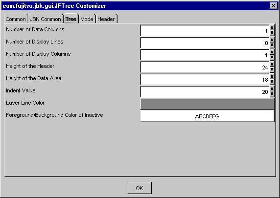
Sets the number of columns. Specify from 1 to 2147483647 as the number of data columns.
Set the number of display lines. Specify from 0 to 2147483647 as the number of display lines.
Set the number of display columns. Specify from 0 to 2147483647 as the number of display columns.
Set the height of the header with a pixel value. Specify from 0 to 2147483647 as the height of the header.
Note
A system sometimes becomes unstable when very big value is established in the height of the header.
Set the height of the data-area line with a pixel value. Specify from 0 to 2147483647 as the height of the data area.
Note
A system sometimes becomes unstable when very big value is established in the height of the data area.
A node of a different level is indented and displayed. Set the indent value with a pixel value. Specify from 5 to 2147483647 as the indent value.
Set the color of the layer line. When the button is pressed, Color setting dialog is displayed.
Set the foreground/background color of inactive. When the button is pressed, [Foreground Color/Background Color] setting dialog is displayed.
Mode
Set various tree modes such as multiple selection and editing.
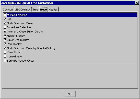
Set whether to enable multiple selection. If this item is checked, multiple selection is enabled. If this item is not checked, single selection is enabled.
Set whether editing is enabled. If this item is checked, editing is enabled.
If editing is enabled, data can be edited by clicking the data of the first column with the node selected.
Set whether to enable the node to be opened and closed. If this item is checked, the node can be opened and closed.
Set whether to select the entire line. If this item is checked, the entire line can be selected.
Set display/no display for the open and close button. If this item is checked, the open and close button is displayed.
Set display/no display for the header. If this item is checked, the header is displayed.
Set display/no display for the layer line. If this item is checked, the layer line is displayed.
Set display/no display for the root node. If this item is checked, the root node is displayed.
Set whether to open and close the node by double-clicking. If this item is checked, the node can be opened and closed by double-clicking.
Set whether to enable the view mode. If this item is checked, the mode becomes view mode and tree editing is disabled.
Set whether to control drawing or not. If this item is checked, Tree is not drawn until this mode is not set.
Set whether to enable scrolling with mouse wheel. If checked, scrolling with mouse wheel operation is enabled.
Header
Sets the tree header information.
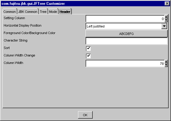
Specify the column index of the header to be set. For the index, set a series of positive integers starting at 0. The maximum value of the index is the number of data columns minus 1.
For a column thus specified, set a 'Horizontal Display Position', 'Foreground Color/Background Color', 'Character String', 'Sort', 'Column Width Change' and 'Column Width' shown below.
Select the horizontal display position of the strings from among Left justified, Centered or Right justified.
Set the foreground color and background color of the header. When the button is pressed, [Foreground Color/Background Color] setting dialog is displayed.
Set the header character string.
Set whether to enable sorting. If this item is checked, sorting is enabled.
Set whether to enable the changing of the column width. If this item is checked, the column width can be changed.
When the mouse pointer is positioned on the column boundary while changing is enabled, the mouse pointer changes its form. Dragging in that status can change the column width.
Set the column width with a pixel value. Specify from 0 to 2147483647 as the column width.