The Bean customizer of the basic GUI library has the following common properties and common property setting dialogs.
Note
Note the following when you manipulate the Bean customizer of the basic GUI library.
A memory shortage may occur, depending on the environment, if a large numeric value or character string is set in the customizer screen.
It is recommended to restart the system if a memory shortage message appears on the screen.
Component common property
Set the component common information.
Set the component name.
This function, unlike the screen designer (screen edit function) of the integrated development environment that sets the name of an instance itself, sets a name as a property value in the instance. Use this property value to set the same name for different instances.
The initial value is the GUIBeans library name plus the number of instances created in the current development environment. The ordinal number in the initial value "GUIBeans library name + ordinal number" increments but has no other regularity because the number of instances created differs from that on the screen designer depending on the development environment and operation procedure.
Set the font. When the button is pressed, [Font] setting dialog is displayed.
Set the foreground color and background color. When the button is pressed, [Foreground Color/Background Color] setting dialog is displayed.
Set whether the component operation is enabled. If this item is checked, the component operation is enabled.
Set whether to display the component on the screen. If this item is checked, the component is displayed.
Set whether to enable setting of the focus for the component. If this item is checked, the focus can be set.
Set whether to use the focus traversal key. If this item is checked, focus can be used.
Set whether to ignore paint messages from the OS. If this item is checked, paint messages from the OS are ignored.
JBK GUI common property
Set the component common information.
Select the component border from among None, Flat, Convex, or Concave.
This is invalid in each class (Bean) of choice, slider, status bar, and tool bar.
Set the border color.
Press the button to display [Border Color] setting dialog.
You can set a border color if the border type is Flat, Convex, and Concave.
This entry is disabled for the slider, status bar, and tool bar classes (Beans).
Set the border width with a pixel value. Specify from 0 to 2147483647 as the border width.
This entry is disabled for the choice, slider, status bar, and tool bar classes (Beans).
Note
A system sometimes becomes unstable when very big value is established in the border width.
Set display/no display for the popup menu. If this item is checked, the popup menu can be displayed with applications.
Set whether to control enable added component in accordance with this component.
If this item is checked, set to control component.
This entry is enabled for the group box, light weight panel, table, tab panel, and tool bar classes (Beans). And this entry is disabled for other classes (Beans).
Set display/no display for the tool tip. If this item is checked, the tool tip is displayed.
Set the character string displayed as the tool tip.
[Foreground Color/Background Color] setting dialog
Set the foreground color and background color.
Select the target of change (Foreground Color/Background Color).
Select one of the colors provided in a list beforehand from among Default Color, Black, Blue, Cyan, DarkGray, Gray, Green, LightGray, Magenta, Orange, Pink, Red, White, Yellow.
Displays the current foreground color and background color.
Displays the RGB value of the current color with a slider or numeric value (0-255). You can set a precise color that cannot be displayed by the basic color.
Displays the foreground color and background color of the created color.
Specified value is made effective, and dialog is closed.
Specified value is invalidated, and dialog is closed.
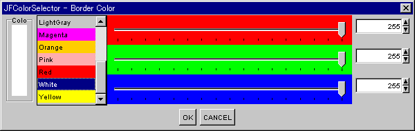
[Border Color] setting dialog
Set the border color.
Select the color type to change from among Basic Color, lightHighligh, highlight, DarkShadow, or Shadow.
Select one of the colors provided in a list beforehand from among Default Color, Black, Blue, Cyan, DarkGray, Gray, Green, LightGray, Magenta, Orange, Pink, Red, White, Yellow.
Display the current border colors.
Displays the RGB value of the current color with a slider or numeric value (0-255). You can set a precise color that cannot be displayed by the basic color.
Display created border colors.
Specified value is made effective, and dialog is closed.
Specified value is invalidated, and dialog is closed.
Color setting dialog
Set the color.
Displays the current color. When the color is set with the basic color or slider, the color to be set is displayed.
Select one of the colors provided in a list beforehand from among Default Color, Black, Blue, Cyan, DarkGray, Gray, Green, LightGray, Magenta, Orange, Pink, Red, White, Yellow.
Displays the RGB value of the current color with a slider or numeric value (0-255). You can set a precise color that cannot be displayed by the basic color.
Specified value is made effective, and dialog is closed.
Specified value is invalidated, and dialog is closed.
[Font] setting dialog
Set the component font.
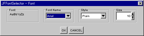
Displays the font to be used by the component.
Select the font.
Select the font style from among plain, bold, italic, or bold italic.
Set the font size. Specify from 0 to 2147483647 as the font size.
Specified value is made effective, and dialog is closed.
Specified value is invalidated, and dialog is closed.
[Input Limitation] setting dialog
Set the input restriction of character string.
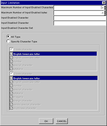
Set the maximum number of input enabled characters. When -1 is set, the maximum number of input characters is not checked. Specify from -1 to 2147483647 as the maximum number of input enabled characters.
Set the maximum number of input-enabled bytes. When -1 is set, the maximum number of input input-enabled bytes is not checked. The specified value is invalid if maximum number of input enabled characters is bigger than -1. Specify from -1 to 2147483647 as the maximum number of input-enabled bytes.
Set the characters that to be allowed for input. Set as a character string the characters that you want to allow for input.
Set the characters that to be not allowed for input. Set as a character string the characters that you do not want to allow for input.
Set the input enabled character set from All Type and Specify Character Type.
In case of Specify Character Type, if the type isn't checked, it is not enabled. If the part of the character kind which can't be inputted be made to input, it is specified by 'Input Enabled Character'.
Specified value is made effective, and dialog is closed.
Specified value is invalidated, and dialog is closed.
[Cell] setting dialog
Set the cell property.
Mode
Set the mode of cells.
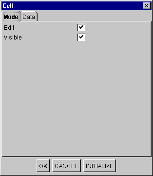
Set whether editing is enabled. If this item is checked, editing is enabled.
Set display/no display for the value. If this item is checked, the value is displayed.
Specified value is made effective, and dialog is closed.
Specified value is invalidated, and dialog is closed.
Set the initial value of the cell.
The initial value is construct new cell's one.
Data
Set the cell data.
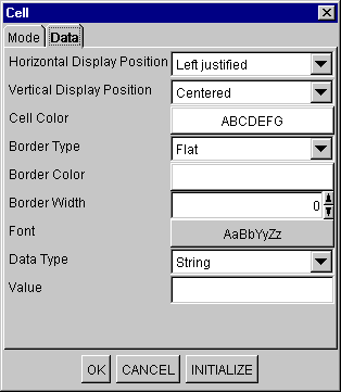
Select the horizontal display position of the strings from among Left justified, Centered or Right justified.
Select the vertical display position of the strings from among Top-justified, Centered or Bottom-justified.
Set the foreground color and background color of the cell. When the button is pressed, [Foreground Color/Background Color] setting dialog is displayed.
Set the border type from among Flat, Convex, or Concave.
Set the border color. When the button is pressed, Color setting dialog is displayed.
Set the border width with a pixel value. Specify from 0 to 5 as the border width.
Set the font. When the button is pressed, [Font] setting dialog is displayed.
Select the data type from among String, Numeric or Boolean. The input field of 'Value' depends on 'Data Type'.
Set the value of the selected node column. The set value is set as the following object class.
String type: java.lang.String
Numeric type: java.lang.Long
Boolean type: java.lang.Boolean
Specified value is made effective, and dialog is closed.
Specified value is invalidated, and dialog is closed.
Set the initial value of the cell.
The initial value is construct new cell's one.