The list format Bean has the following information and Customizer functions.
See
"Package Guide"- JFListView
Property information
Name | Type | Reference | Setting | Explanation |
|---|---|---|---|---|
addDataRows | com.fujitsu.jbk.gui | Y | Adds the data of the specified rows and columns after the last row | |
adjustHeader | boolean | Y | Y | Whether to display the dummy column header |
alignment | com.fujitsu.jbk.gui | Y | Display position of the specified column character string | |
background | java.awt | Y | Y | Background color |
borderColor | java.awt | Y | Y | Border line color |
borderType | int | Y | Y | Border line type |
borderWidth | int | Y | Y | Border line width |
cellBackground | com.fujitsu.jbk.gui | Y | Background color | |
cellForeground | com.fujitsu.jbk.gui | Y | Foreground color | |
columnAlignment | com.fujitsu.jbk.gui | Y | Display position of the string of the whole specified column | |
columnCount | int | Y | Y | Number of data columns |
columnWidth | com.fujitsu.jbk.gui | Y | Column width of the specified column | |
columns | int | Y | Y | Number of display columns |
componentOrientation | java.awt | Y | Y | The orientation of the string. It depends on the language |
cursorIndex | int | Y | Y | Line where the cursor is |
deselect | int | Y | Deselection | |
enableChangeWidth | com.fujitsu.jbk.gui | Y | Changing of the display width of the specified column enabled/disabled | |
enableMenu | boolean | Y | Y | Whether to display the popup menu |
enableSort | com.fujitsu.jbk.gui | Y | Sorting with the specified column data as key enabled/disabled | |
enableToolTip | boolean | Y | Y | Whether to display the tool tip |
enabled | boolean | Y | Y | Whether enabled |
focusTraversalKeysEnabled | boolean | Y | Y | Whether the focus traversal key is available |
focusable | boolean | Y | Y | Whether the focus can be set |
font | java.awt | Y | Y | Font |
foreground | java.awt | Y | Y | Foreground color |
headerAlignment | com.fujitsu.jbk.gui | Y | Display position of the string of the specified header | |
headerHeight | int | Y | Y | Height of column header |
headerImage | (Array) | (Array) | (Array) | Image displayed in the column header specified by the column |
headerObject | (Array) | (Array) | (Array) | Object of the column header specified by the column |
headerObjectToString | (Array) | (Array) | (Array) | Object for setting the character string set in the column header |
headerString | com.fujitsu.jbk.gui | Y | Character string displayed in the column header specified by the column | |
horizontalUnitIncrement | int | Y | Y | Unit increment value of horizontal scrollbar |
ignoreRepaint | boolean | Y | Y | Whether the paint message of the operating system should be ignored |
locale | java.util | Y | Y | Locale information |
multipleMode | boolean | Y | Y | Multiple selection mode/single selection mode |
name | java.lang | Y | Y | Name |
preferredColumnWidth | (Array) | (Array) | Optimum column width of the specified column | |
remoteFont | boolean | Y | Whether the registered font is a remote font | |
rowCount | int | Y | Y | Number of data lines |
rowHeight | int | Y | Y | Height of one line in data area |
rows | int | Y | Y | Number of lines displayed in the data area |
select | int | Y | Selection | |
selectBackground | java.awt | Y | Y | Background color of a selected cell |
selected | (Array) | (Array) | Whether the specified line is selected | |
selectedCount | int | Y | Number of lines in the selected status | |
selectedIndex | int | Y | Selected line | |
selectedIndexes | int[] | Y | Array of all lines in the selected status | |
selectedObjects | java.lang | Y | First object array on the line in the selected status | |
selectForeground | java.awt | Y | Y | Foreground color of a selected cell |
string | com.fujitsu.jbk.gui | Y | Character string | |
toolTipText | java.lang | Y | Y | Tool tip text |
topIndex | int | Y | Y | Line displayed at the beginning |
viewMode | boolean | Y | Y | Whether the mode is view mode |
visible | boolean | Y | Y | Whether visible |
visibleHScrollbar | boolean | Y | Horizontal scroll bar display/no display | |
visibleHeader | boolean | Y | Y | Column header display/no display |
visibleVScrollbar | boolean | Y | Vertical scroll bar display/no display | |
wheelScrollingEnabled | boolean | Y | Y | Whether to enable scrollbar operation with mouse wheel |
Event information
Name | Listener | Addition/removal | Method | Explanation |
|---|---|---|---|---|
action | java.awt.event | addActionListener | actionPerformed | Is issued when the mouse is double-clicked or when the Enter key is pressed. |
component | java.awt.event | addComponentListener | componentResized | Is issued when the component status changes. |
componentMoved | ||||
componentShown | ||||
componentHidden | ||||
focus | java.awt.event | addFocusListener | focusGained | Is issued when the focus moves. |
focusLost | ||||
inputMethod | java.awt.event | addInputMethodListener | caretPositionChanged | Is issued when the input method status changes. |
inputMethodTextChanged | ||||
item | java.awt.event | addItemListener | itemStateChanged | Is issued when the line is selected/deselected. |
key | java.awt.event | addKeyListener | keyTyped | Is issued by key operation. |
keyPressed | ||||
keyReleased | ||||
mouse | java.awt.event | addMouseListener | mouseClicked | Is issued by mouse operation. |
mousePressed | ||||
mouseReleased | ||||
mouseEntered | ||||
mouseExited | ||||
mouseMotion | java.awt.event | addMouseMotionListener | mouseDragged | Is issued when the mouse moves. |
mouseMoved | ||||
mouseWheel | java.awt.event | addMouseWheelListener | mouseWheelMoved | Is issued by mouse wheel operation. |
propertyChange | java.beans | addPropertyChangeListener | propertyChange | Is issued when the property changes. |
Method information
Name | Parameters | Explanation |
|---|---|---|
addRow | Adds null line data to the end of the line. | |
deselect | int | Deselects the specified line. |
exchangeColumn | int | Replaces the specified column. |
int | ||
exchangeRow | int | Replaces the specified line. |
int | ||
getSelectForeground | int | Returns the foreground color of a cell when it is selected. |
int | ||
getSelectBackground | int | Returns the background color of a cell when it is selected. |
int | ||
hideToolTip | Erases the tool tip. | |
insertRow | int | Inserts a null line data into the specified line. |
removeRow | int | Deletes the line data of the specified line. |
requestFocus | Requests an input focus. | |
search | char | Moves the cursor and selection process onto the line that begins with the specified character. |
select | int | Selects the specified line. |
setColumnSelectBackground | int | Returns the background color of a column when it is selected. |
java.awt | ||
setColumnSelectForeground | int | Returns the foreground color of a column when it is selected. |
java.awt | ||
setRowSelectBackground | int | Returns the background color of a row when it is selected. |
java.awt | ||
setRowSelectForeground | int | Returns the foreground color of a row when it is selected. |
java.awt | ||
setSelectBackground | int | Sets the background color of a cell when it is selected. |
int | ||
java.awt | ||
setSelectForeground | int | Sets the foreground color of a cell when it is selected. |
int | ||
java.awt | ||
showToolTip | java.lang | Displays the tool tip. |
java.awt | ||
java.awt | ||
long | ||
sort | int | Uses the information of the specified column to sort lines. |
boolean | ||
transferFocus | Moves the focus to the next component. |
Customizer
Mode
Set the list mode.
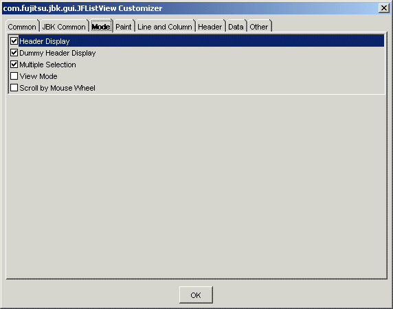
Set display/no display for the header. If this item is checked, the header is displayed.
Set dummy header display/no display. If this item is checked, the dummy header is displayed.
Set multiple selection/single selection. If this item is checked, multiple selection is enabled. If this item is unchecked, single selection is enabled.
Set view mode/no view mode. If this item is checked, the mode becomes view mode and editing in the list is disabled.
Set whether to enable scrolling with mouse wheel. If checked, scrolling with mouse wheel operation is enabled.
Paint
Set the information relating to list display.
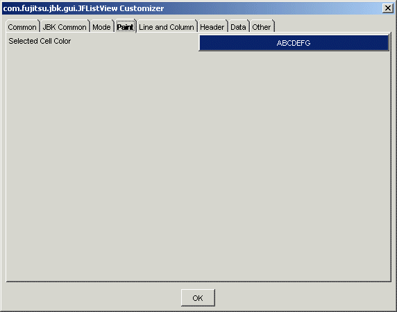
Set the foreground color and background color of the selected cell. When the button is pressed, [Foreground Color/Background Color] setting dialog is displayed.
Line and Column
Set the list line and column information.
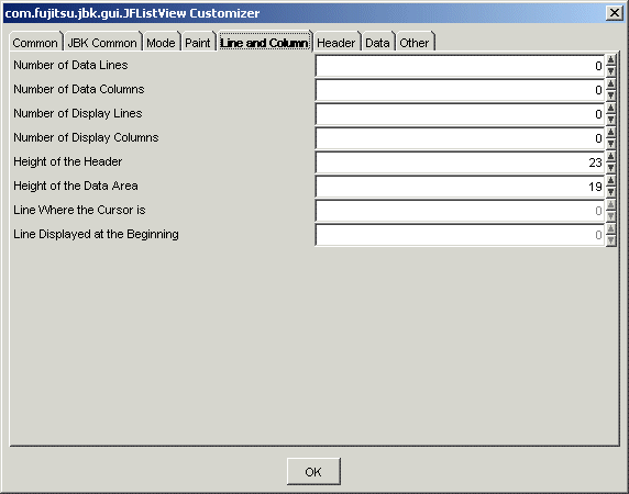
Set the number of data lines. Specify from 0 to 2147483647 as the number of data lines.
Set the number of data columns. Specify from 0 to 2147483647 as the number of data columns.
Set the number of display lines. Specify from 0 to 2147483647 as the number of display lines.
Set the number of display columns. Specify from 0 to 2147483647 as the number of display columns.
Set the height of the header with a pixel value. Specify from 0 to 2147483647 as the height of the header.
Set the height of the data area with a pixel value. Specify from 0 to 2147483647 as the height of the data area.
Set the line to display the cursor. For the line, set a series of positive integers starting at 0. The maximum value of the line is the number of data lines minus 1.
Set the line to display at the beginning. For the line, set a series of positive integers starting at 0. The maximum value of the line is the number of data lines minus 1.
Header
Set the list header.
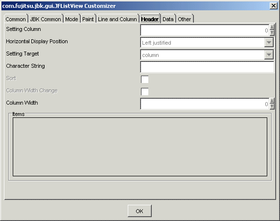
In the initial status, header property cannot be set because the list sizes (number of lines and number of columns) are not defined. First, set the number of lines and number of columns in the 'Line and Column' property, then set the value in each header. To edit the header, specify the index of the edit column.
Set the header column. For the header column, set a series of positive integers starting at 0. The maximum value of the header column is the number of data columns minus 1.
Select the horizontal display position of the strings of the header from among Left justified, Centered or Right justified.
Select the valid range of the horizontal display position from Entire column/Header.
Set the header character string.
Set whether to enable sorting. If this item is checked, sorting is enabled.
Set whether to enable the changing of the column width. If this item is checked, the column width can be changed.
When the mouse pointer is positioned on the column boundary while changing is enabled, the mouse pointer changes its form. Dragging in that status can change the column width.
Set the column width with a pixel value. Specify from 0 to 2147483647 as the column width.
Displays the data specified for the items.
Data
Set the list data.
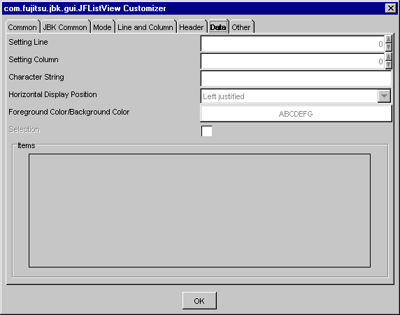
In the initial status, the data cannot be set because the list sizes (the number of lines and number of columns) are not defined. First, set the number of lines and number of columns in the 'line and column' property, then set data on each line and column. To edit data, specify the (index of the) line and column to be edited.
Set the data setting line. For the data setting line, set a series of positive integers starting at 0. The maximum value of the data setting line is the number of display rows minus 1.
Set the data setting column. For the data setting column, set a series of positive integers starting at 0. The maximum value of the data setting column is the number of display columns minus 1.
Set the character string to be set.
Select the horizontal display position of the strings of the data from among Left justified, Centered or Right justified.
Set the foreground color/background color of data. When the button is pressed, the Foreground Color/Background Color setting dialog is displayed.
Set the line specified in 'Setting Line' to the selected status/deselected status. If this item is checked, the status becomes selected.
Displays the data specified for the items.
Other
Set other information.
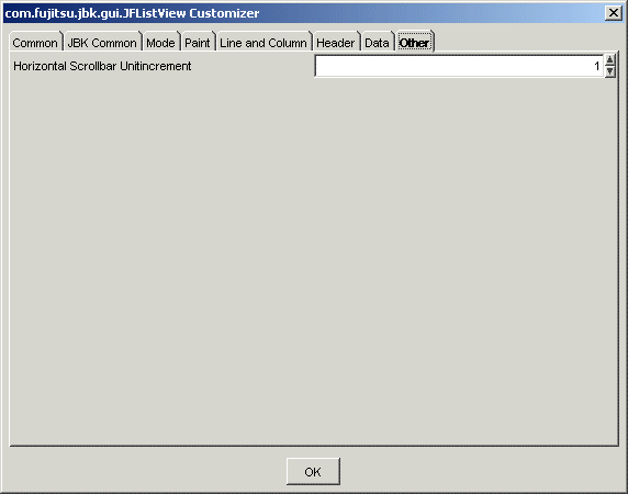
Set the unit increment value of the horizontal scrollbar. Specify from 1 to 2147483647 as the value.