The image button Bean has the following information and Customizer functions.
See
"Package Guide"- JFImageButton
Property information
Name | Type | Reference | Setting | Explanation |
|---|---|---|---|---|
alignmentHorizontal | int | Y | Y | Horizontal display position of image |
alignmentVertical | int | Y | Y | Vertical display position of image |
autoTurn | boolean | Y | Y | Automatic loopback/no automatic loopback |
background | java.awt | Y | Y | Background color |
borderColor | java.awt | Y | Y | Border line color |
borderType | int | Y | Y | Border line type |
borderWidth | int | Y | Y | Border line width |
buttonDisplay | int | Y | Y | Button display mode (image, label, image and label) |
buttonType | int | Y | Y | Button type (pushbutton, switch button) |
characterCodeMapped | boolean | Y | Y | Whether to convert incompatible character code |
componentOrientation | java.awt | Y | Y | The orientation of the string. It depends on the language |
enableMenu | boolean | Y | Y | Whether to display the popup menu |
enableToolTip | boolean | Y | Y | Whether to display the tool tip |
enabled | boolean | Y | Y | Whether enabled |
enableDoubleClick | boolean | Y | Y | Whether to enable double-click |
focusTraversalKeysEnabled | boolean | Y | Y | Whether the focus traversal key is available |
focusable | boolean | Y | Y | Whether the focus can be set |
font | java.awt | Y | Y | Font |
foreground | java.awt | Y | Y | Foreground color |
ignoreRepaint | boolean | Y | Y | Whether the paint message of the operating system should be ignored |
imageRegion | java.awt | Y | Y | the rectangle which does drawing of the image |
imageURL | java.net | Y | Y | URL of image |
inactiveBackground | java.awt | Y | Y | Background color when inactive |
inactiveForeground | java.awt | Y | Y | Foreground color when inactive |
label | java.lang | Y | Y | Button label |
labelPosition | java.awt | Y | Y | Position of label |
locale | java.util | Y | Y | Locale information |
name | java.lang | Y | Y | Name |
remoteFont | boolean | Y | Whether the registered font is a remote font | |
state | boolean | Y | Y | Value for switch button |
toolTipText | java.lang | Y | Y | Tool tip text |
visible | boolean | Y | Y | Whether visible |
Event information
Name | Listener | Addition/removal | Method | Explanation |
|---|---|---|---|---|
action | java.awt.event | addActionListener | actionPerformed | Is issued when the button is pressed by the mouse or key. |
component | java.awt.event | addComponentListener | componentResized | Is issued when the component status changes. |
componentMoved | ||||
componentShown | ||||
componentHidden | ||||
focus | java.awt.event | addFocusListener | focusGained | Is issued when the focus moves. |
focusLost | ||||
inputMethod | java.awt.event | addInputMethodListener | caretPositionChanged | Is issued when the input method status changes. |
inputMethodTextChanged | ||||
key | java.awt.event | addKeyListener | keyTyped | Is issued by key operation. |
keyPressed | ||||
keyReleased | ||||
mouse | java.awt.event | addMouseListener | mouseClicked | Is issued by mouse operation. |
mousePressed | ||||
mouseReleased | ||||
mouseEntered | ||||
mouseExited | ||||
mouseMotion | java.awt.event | addMouseMotionListener | mouseDragged | Is issued when the mouse moves. |
mouseMoved | ||||
mouseWheel | java.awt.event | addMouseWheelListener | mouseWheelMoved | Is issued by mouse wheel operation. |
propertyChange | java.beans | addPropertyChangeListener | propertyChange | Is issued when the property changes. |
Method information
Name | Parameters | Explanation |
|---|---|---|
hideToolTip | Erases the tool tip. | |
requestFocus | Requests an input focus. | |
showToolTip | java.lang | Displays the tool tip. |
java.awt | ||
java.awt | ||
long | ||
transferFocus | Moves the focus to the next component. |
Customizer
Paint
Set the image button display information.
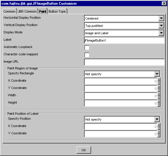
Select the horizontal display position of the strings of th image button from among Left justified, Centered or Right justified. This specification is valid for simultaneous display of the image or the label.
Select the vertical display position of the strings of the image button from among Top-justified, Centered or Bottom-justified. This specification is valid for simultaneous display of the image or the label.
Select the image button display mode from among Image, Label, or Image and Label.
Set the label of the image button when 'Display Mode' is "Label" or "Image and Label".
Set whether to fold the label string automatically or not. If checked, the label is automatically folded.
Set whether to convert YEN SIGN. If checked, character code conversion is performed.
For the character codes to be converted, see the following table:
SJIS | Unicode | Microsoft |
|---|---|---|
0x815F | 0x005C[REVERSE SOLIDUS] | [Unicode]U+00A5[YEN SIGN] |
Set the URL where the image displayed in the image button is stored.
Set the foreground/background color of inactive. When the button is pressed, [Foreground Color/Background Color] setting dialog is displayed.
Set whether to set the rectangle which does drawing of the image.
Set the x coordinate of the rectangle. A rectangle is specified by the relative coordinate on the component. Specify from -2147483648 to 2147483647 as the x coordinate.
Set the y coordinate of the rectangle. A rectangle is specified by the relative coordinate on the component. Specify from -2147483648 to 2147483647 as the y coordinate.
Set the width of the rectangle. A rectangle is specified by the relative coordinate on the component. Specify from -2147483648 to 2147483647 as the width.
Set the height of the rectangle. A rectangle is specified by the relative coordinate on the component. Specify from -2147483648 to 2147483647 as the height.
Note
A system sometimes becomes unstable when very big value is established in the rectangle that is specify from 'X Coordinate', 'Y Coordinate', 'Width', and 'Height'.
Set whether to set the position of drawing of the label.
Set the x coordinate of the label. A position is specified by the relative coordinate on the part. Specify from -2147483648 to 2147483647 as the x coordinate.
Set the y coordinate of the label. A position is specified by the relative coordinate on the part. Specify from -2147483648 to 2147483647 as the y coordinate.
Button Type
Set the button type of the image button.
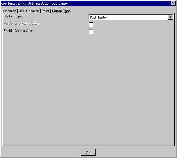
Select the image button type from among Push button, or Switch button.
Set the ON/OFF status for the switch button when the image button type is switch button. If this item is checked, the status becomes ON. If this item is unchecked, the status becomes OFF.
Specifies whether to enable double-click. If this item is checked, double-click is enabled.