The embedded character string field Bean has the following information and Customizer functions.
See
"Package Guide"- JFFieldFilled
Property information
Name | Type | Reference | Setting | Explanation |
|---|---|---|---|---|
alignmentHorizontal | com.fujitsu.jbk.gui | Y | Display position of the field horizontal character string | |
alignmentVertical | int | Y | Y | Display position of vertical character string |
autoEscape | boolean | Y | Y | Automatic exit function valid/invalid |
autoIME | com.fujitsu.jbk.gui | Y | Automatic change of input mode | |
background | java.awt | Y | Y | Background color |
blink | boolean | Y | Y | Whether to blink the character string |
blinkInterval | long | Y | Y | Interval of blinking the character string and caret |
borderColor | java.awt | Y | Y | Border line color |
borderType | int | Y | Y | Border line type |
borderWidth | int | Y | Y | Border line width |
caretPosition | com.fujitsu.jbk.gui | Y | Caret position in the field | |
caretStyle | (Array) | (Array) | (Array) | Caret style for the input field |
caretVisible | boolean | Y | Y | Display/non-display of the input caret |
columnBaseChar | char | Y | Y | The base character to be used on calculating the width of field |
combinedText | java.lang | Y | Y | The whole string including the delimiters |
componentOrientation | java.awt | Y | Y | The orientation of the string. It depends on the language |
echoChar | char | Y | Y | Echo character |
editable | boolean | Y | Y | Whether editing is enabled |
enableChars | com.fujitsu.jbk.gui | Y | Input-enabled character of the specified field | |
enableMenu | boolean | Y | Y | Whether to display the popup menu |
enableToolTip | boolean | Y | Y | Whether to display the tool tip |
enableType | com.fujitsu.jbk.gui | Y | Input-enabled character set of the field | |
enabled | boolean | Y | Y | Whether enabled |
fieldCount | int | Y | Y | Number of fields |
focusField | int | Y | Y | Field index that has input focus |
focusTraversalKeysEnabled | boolean | Y | Y | Whether the focus traversal key is available |
focusable | boolean | Y | Y | Whether the focus can be set |
font | java.awt | Y | Y | Font |
foreground | java.awt | Y | Y | Foreground color |
fullField | com.fujitsu.jbk.gui | Y | Whether the item is all-digit input item | |
ignoreRepaint | boolean | Y | Y | Whether the paint message of the operating system should be ignored |
inactiveBackground | java.awt | Y | Y | Background color when inactive |
inactiveForeground | java.awt | Y | Y | Foreground color when inactive |
indispensableField | com.fujitsu.jbk.gui | Y | Whether the item is a required input item | |
inputAssist | com.fujitsu.jbk.gui | Y | Input assist method | |
inputMode | com.fujitsu.jbk.gui | Y | Character set and character size | |
inputStyle | com.fujitsu.jbk.gui | Y | Character string conversion window type | |
insertMode | int | Y | Y | Input mode |
locale | java.util | Y | Y | Locale information |
maxLength | com.fujitsu.jbk.gui | Y | Maximum number of characters in the field | |
maximumValue | com.fujitsu.jbk.gui | Y | Maximum value in the field | |
minimumValue | com.fujitsu.jbk.gui | Y | Minimum value in the field | |
name | java.lang | Y | Y | Name |
numericalField | (Array) | (Array) | Whether the field is a numeric field | |
pattern | java.lang | Y | Y | Pattern |
remoteFont | boolean | Y | Whether the registered font is a remote font | |
reverse | boolean | Y | Y | Whether to display in reverse video or not |
selectedInFocus | boolean | Y | Y | Whether to select all the character string when focused or not |
selectionEnd | com.fujitsu.jbk.gui | Y | Field selection end position | |
selectionStart | com.fujitsu.jbk.gui | Y | Field selection start position | |
selectviewMode | boolean | Y | Y | Multiple fields selection |
showSeparator | boolean | Y | Y | Whether the separator is shown or not |
signedNumerical | boolean | Y | Y | Whether or not to permit for the user to enter the numeric sign to the field |
staticText | com.fujitsu.jbk.gui | Y | Character string in the delimiter character string area | |
strikeColor | java.awt | Y | Y | Color of strike-through line |
strikeType | int | Y | Y | Type of strike-through line |
text | (Array) | (Array) | (Array) | Field character string |
textEditKey | com.fujitsu.jbk.gui | Y | Y | Function key manager |
toolTipText | java.lang | Y | Y | Tool tip text |
underlineColor | java.awt | Y | Y | Underline color |
underlineType | int | Y | Y | Underline type |
value | (Array) | (Array) | (Array) | Field value |
visible | boolean | Y | Y | Whether visible |
Event information
Name | Listener | Addition/removal | Method | Explanation |
|---|---|---|---|---|
action | java.awt.event | addActionListener | actionPerformed | Is issued when the Enter key is pressed or when the component is out of focus automatically. |
autoEscape | com.fujitsu.jbk.gui | addAutoEscapeListener | autoEscape | Is issued immediately prior to automatic exit. |
component | java.awt.event | addComponentListener | componentResized | Is issued when the component status changes. |
componentMoved | ||||
componentShown | ||||
componentHidden | ||||
focus | java.awt.event | addFocusListener | focusGained | Is issued when the focus moves. |
focusLost | ||||
inputError | com.fujitsu.jbk.gui | addInputErrorListener | inputError | Is issued when a character string input error occurs. |
inputMethod | java.awt.event | addInputMethodListener | caretPositionChanged | Is issued when the input method status changes. |
inputMethodTextChanged | ||||
key | java.awt.event | addKeyListener | keyTyped | Is issued by key operation. |
keyPressed | ||||
keyReleased | ||||
mouse | java.awt.event | addMouseListener | mouseClicked | Is issued by mouse operation. |
mousePressed | ||||
mouseReleased | ||||
mouseEntered | ||||
mouseExited | ||||
mouseMotion | java.awt.event | addMouseMotionListener | mouseDragged | Is issued when the mouse moves. |
mouseMoved | ||||
mouseWheel | java.awt.event | addMouseWheelListener | mouseWheelMoved | Is issued by mouse wheel operation. |
propertyChange | java.beans | addPropertyChangeListener | propertyChange | Is issued when the property changes. |
text | java.awt.event | addTextListener | textValueChanged | Is issued when a character is input. |
Method information
Name | Parameters | Explanation |
|---|---|---|
addEnableChar | int | Adds the input enabled character to the field. |
char | ||
checkFullField | Checks all-digit input in all fields. | |
checkFullField | int | Checks all-digit input in the specified field. |
checkIndispensableField | Checks the required input in all fields. | |
checkIndispensableField | int | Checks the required input in the specified field. |
copy | int | Copies the selected area of the specified field onto the clipboard. |
cut | int | Copies the selected area of the specified field onto the clipboard and deletes it. |
hideToolTip | Erases the tool tip. | |
insertText | java.lang | Inserts the character string into the selected area. |
paste | int | Replaces the character string in the specified field selection area with the character string in the clipboard. |
removeNotify | Notifies a component that it has been removed from the container. If a peer exists, it is destroyed. | |
requestFocus | Requests an input focus. | |
select | int | Selects the specified field. |
int | ||
int | ||
showToolTip | java.lang | Displays the tool tip. |
java.awt | ||
java.awt | ||
long | ||
transferFocus | Moves the focus to the next component. |
Customizer
Field
Set the field delimiter character string and number of fields.
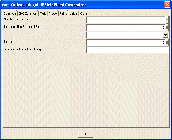
Set the number of fields to be created. Specify from 1 to 2147483647 as the number of fields.
Set the index of the field that has the input focus. For the index, set a series of positive integers starting at 0. The maximum value of the index is the number of fields minus 1.
Set a format pattern from among XXXXXXXX(the number of fields), XXhXXmXXs, XXXX/XX/XX, 255.XXX.XXX.XXX, (03)XXXX-XXXX, XXX-XXXX, or XXX is XXXX.. This enables the delimiter character strings and fields to be set together.
Set the index of a delimiter character string. For the index, set a series of positive integers starting at 0. The maximum value of the index is the number of fields.
Set the delimiter character string at the position set by 'Index'.
Mode
Set the operation mode in the embedded character string field.
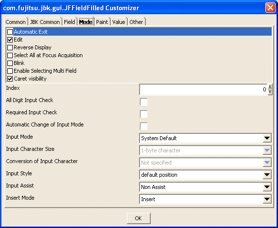
Set automatic exit or no automatic exit. If this item is checked, automatic exit is performed. This item is valid for the entire embedded character string field.
Set whether to enable editing. If this item is checked, editing is enabled. This item is valid for the entire embedded character string field.
Set the reverse video mode or not. If this is checked, the display is in reverse mode. This item is valid for the entire embedded character string field.
Set to select all the character string or not when acquiring input focus. If this item is checked, all are selected. This item is valid for the entire embedded character string field.
Set to blink character string or not. If checked, the character string blinks. The interval time can be set in the 'Blink Interval' of the 'Paint' property. This item is valid for the entire embedded character string field.
Set whether to enable selecting multiple field. If this item is checked, the multiple selecting is enabled.
Set the display status of the input caret. If checked, the input caret is displayed.
Set the index of the field delimited by a delimiter character string. For the index, set a series of positive integers starting at 0. The maximum value of the index is the number of fields minus 1.
Set whether the field specified with 'Index' is checked if all digits are input or not. If checked, the field is checked if all digits are input.
Set whether the field specified with 'Index' is checked if the required field is input or not. If checked, the field is checked if the required field is input.
Set whether to change the input mode automatically when the input focus moves to the field set with 'Index'. If checked, the input mode will be changed.
Select the input mode of the field set by 'Index' from among Alphanumeric, Hiragana, Katakana, Direct input, or System Default. This is available only when 'Automatic Change of Input Mode' is checked.
Select the input character size of the field set by 'Index' from 1-byte character or 2-byte character. This is available only when 'Automatic Change of Input Mode' is checked.
Select the conversion mode for the input character string from among Conversion, None or Not specified. This is available only when 'Automatic Change of Input Mode' is checked.
Select the display position of the string conversion window of the field set with 'Index' from default position/component. To use this function, 'Automatic Change of Input Mode' must be checked.
Set whether to assist input of characters in the field set with 'Index' using a Japanese input system. By setting the conversion method, determination operations during input can be omitted.
Set the insert mode of strings. Select the insert mode from Insert/Overwrite.
Paint
Set the information concerning the embedded character string field display.
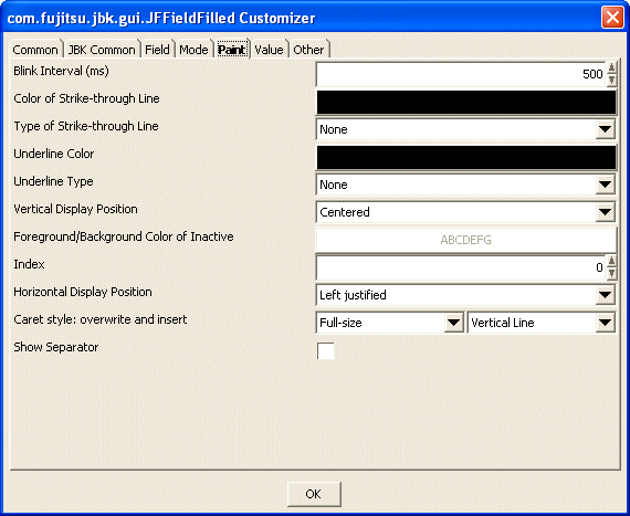
Set the blink interval of the display character string in milliseconds (ms). This item is valid for the entire embedded character string field. Specify from 1 to 9223372036854775807 as the blink interval.
Set the color of the strike-through line. When the button is pressed, Color setting dialog is displayed. This item is valid for the entire embedded character string field.
Select the type of the strike-through lines from among None, -(single line) or =(double lines). This item is valid for the entire embedded character string field.
Set the underline color. When the button is pressed, Color setting dialog is displayed. This item is valid for the entire embedded character string field.
Select the underline type from among None, Convex, Concave, or Flat. This item is valid for the entire embedded character string field.
Select the vertical display position of the strings from among Top-justified, Centered or Bottom-justified. This item is valid for the entire embedded character string field.
Set the foreground/background color of inactive. When the button is pressed, [Foreground Color/Background Color] setting dialog is displayed. This item is valid for the entire embedded character string field.
Set the index of the field delimited by a delimiter character string. For the index, set a series of positive integers starting at 0. The maximum value of the index is the number of fields minus 1.
Select the horizontal display position of the strings in the field set by 'Index' from among Left justified, Centered or Right justified.
Select the caret style from among Vertical Line, Full-size, Half-size, Quarter-size, or Underline. A different status can be set for each input mode: overwrite and insert.
Set whether to show separator. If this item is checked, separator is shown.
Value
Set the value of the embedded character string field.
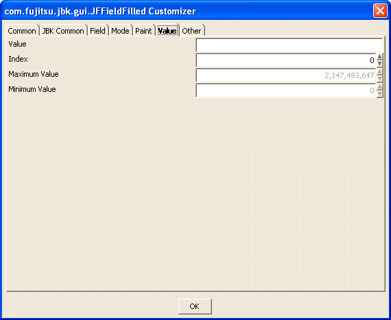
Set the value in the field.
Set the field index. For the index, set a series of positive integers starting at 0. The maximum value of the index is the number of fields minus 1.
Set the maximum value that can be input into the field. The maximum value becomes valid in the numeric field (field that only allows numeric input). Specify from -2147483648 to 2147483647 as the maximum value.
When the minus value is input in the numeric field, set to enable to input the minus sign (the 'Presence of sign' is checked and the 'Input Enabled Character' is "-", in the 'Other' property).
Set the minimum value that can be input into the field. The minimum value becomes valid in the numeric field. Specify from -2147483648 to 2147483647 as the minimum value.
When the minus value is input in the numeric field, set to enable to input the minus sign (the 'Presence of sign' is checked and the 'Input Enabled Character' is "-", in the 'Other' property).
Other
Set other information.
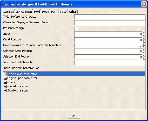
Set the character which is used to decide the size of the component. This item is valid for the entire embedded character string field.
Set the character to display for the password input and displaying. This item is valid for the entire embedded character string field.
Set whether or not the sign of minus enable input to field. If checked, the sign of minus is enabled input. This setup is effective only at the time the 'Input Enabled Character' is "-".
Set the index of the field delimited by a delimiter character string. For the index, set a series of positive integers starting at 0. The maximum value of the index is the number of fields minus 1.
Set the caret position of the field set by 'Index'. Specify from 0 to format pattern (the number of X) as the caret position.
Set the maximum number of input enabled characters of the field set by 'Index'. When -1 is set, the maximum number of input enabled characters is not checked. Specify from 1 to 2147483647 as the maximum number of input enabled characters.
Set the selection start position of the field specified by 'Index'. Specify from 0 to format pattern (the number of X) as the selection start position.
Set the selection end position of the field specified by 'Index'. Specify from 0 to format pattern (the number of X) as the selection end position.
Set the characters that to be allowed for input. Set as a character string the characters that you want to allow for input.
Select the available character set of the field set by 'Index' for the input: English lowercase letter, English uppercase letter, number, special character and 2-byte character. The unchecked character set cannot be used for the input. To partially enable the input of an input disabled character set, set it in the 'Input Enabled Character'.