The checklist Bean has the following information and Customizer functions.
See
"Package Guide"- JFCheckList
Property information
Name | Type | Reference | Setting | Explanation |
|---|---|---|---|---|
add | java.lang | Y | Additional string | |
background | java.awt | Y | Y | Background color |
borderColor | java.awt | Y | Y | Border line color |
borderType | int | Y | Y | Border line type |
borderWidth | int | Y | Y | Border line width |
checkboxBackground | java.awt | Y | Y | Background color of check box |
checkboxForeground | java.awt | Y | Y | Foreground color of check box |
checkboxPosition | int | Y | Y | Display position of check box |
checkedIndexes | int[] | Y | Array of checked indexes | |
checkedItemCount | int | Y | Number of checked items | |
checkedItems | java.lang | Y | Array of checked items | |
componentOrientation | java.awt | Y | Y | The orientation of the string. It depends on the language |
deselect | int | Y | Deselection | |
enableMenu | boolean | Y | Y | Whether to display the popup menu |
enableToolTip | boolean | Y | Y | Whether to display the tool tip |
enabled | boolean | Y | Y | Whether enabled |
focusTraversalKeysEnabled | boolean | Y | Y | Whether the focus traversal key is available |
focusable | boolean | Y | Y | Whether the focus can be set |
font | java.awt Font | Y | Y | Font |
foreground | java.awt | Y | Y | Foreground color |
ignoreRepaint | boolean | Y | Y | Whether the paint message of the operating system should be ignored |
indexSelected | (Array) | (Array) | Whether the specified index is selected | |
insert | com.fujitsu.jbk.gui | Y | Inserted string | |
interlockMode | boolean | Y | Y | Whether the cursor interlocks with the selection status and the check status |
item | (Array) | (Array) | Item | |
itemCount | int | Y | Number of items | |
items | java.lang | Y | Item | |
locale | java.util | Y | Y | Locale information |
multipleMode | boolean | Y | Y | Multiple selection mode/single selection mode |
name | java.lang | Y | Y | Name |
preferredColorDisplay | boolean | Y | Y | Whether display the preferred color |
remoteFont | boolean | Y | Whether the registered font is a remote font | |
remove | int | Y | Removed string | |
replace | com.fujitsu.jbk.gui | Y | Item replacement | |
rowHeight | int | Y | Y | Height of row |
rows | int | Y | Y | Number of displayed lines |
select | int | Y | Selection | |
selectedIndex | int | Y | Selected index | |
selectedItem | java.lang | Y | Selected item | |
selectedObjects | java.lang | Y | Array of selected objects | |
selectviewMode | boolean | Y | Y | Whether the selected item is highlight or not |
state | com.fujitsu.jbk.gui | Y | Status | |
toolTipText | java.lang | Y | Y | Tool tip text |
topIndex | int | Y | Y | Index displayed first |
viewMode | boolean | Y | Y | Whether the mode is view mode |
visible | boolean | Y | Y | Whether visible |
wheelScrollingEnabled | boolean | Y | Y | Whether to enable scrollbar operation with mouse wheel |
Event information
Name | Listener | Addition/removal | Method | Explanation |
|---|---|---|---|---|
action | java.awt.event | addActionListener | actionPerformed | Is issued when the mouse is double-clicked or when the Enter key is pressed. |
check | com.fujitsu.jbk.gui | addCheckListener | itemStateChanged | Is issued when the check box value is changed. |
component | java.awt.event | addComponentListener | componentResized | Is issued when the component status changes. |
componentMoved | ||||
componentShown | ||||
componentHidden | ||||
focus | java.awt.eventFocusListener | addFocusListener | focusGained | Is issued when the focus moves. |
focusLost | ||||
inputMethod | java.awt.event | addInputMethodListener | caretPositionChanged | Is issued when the input method status changes. |
inputMethodTextChanged | ||||
item | java.awt.event | addItemListener | itemStateChanged | Is issued when a line is selected. |
key | java.awt.event | addKeyListener | keyTyped | Is issued by key operation. |
keyPressed | ||||
keyReleased | ||||
mouse | java.awt.event | addMouseListener | mouseClicked | Is issued by mouse operation. |
mousePressed | ||||
mouseReleased | ||||
mouseEntered | ||||
mouseExited | ||||
mouseMotion | java.awt.event | addMouseMotionListener | mouseDragged | Is issued when the mouse moves. |
mouseMoved | ||||
mouseWheel | java.awt.event | addMouseWheelListener | mouseWheelMoved | Is issued by mouse wheel operation. |
propertyChange | java.beans | addPropertyChangeListener | propertyChange | Is issued when the property changes. |
Method information
Name | Parameters | Explanation |
|---|---|---|
add | java.lang | Adds an item. |
deselect | int | Deselects the specified index. |
deselectAll | Deselects all items. | |
hideToolTip | Erases the tool tip. | |
insert | int | Inserts an item in the specified index. |
java.lang | ||
remove | int | Deletes the specified index. |
removeAll | Deletes all items. | |
replace | int | Replaces the specified index item. |
java.lang | ||
requestFocus | Requests an input focus. | |
select | int | Selects the specified index. |
showToolTip | java.lang | Displays the tool tip. |
java.awt | ||
java.awt | ||
long | ||
sort | boolean | Specifies ascending or descending order and sorts. |
transferFocus | Moves the focus to the next component. |
Customizer
Color
Set the color to be used in the checklist.

Set the foreground color and background color of the check box. When the button is pressed, [Foreground Color/Background Color] setting dialog is displayed.
Set to paint by preferred color or usual color. If this item is checked, paint by preferred color (when to be not use, paint by impossibility color).
Mode
Set information concerning the checklist status.
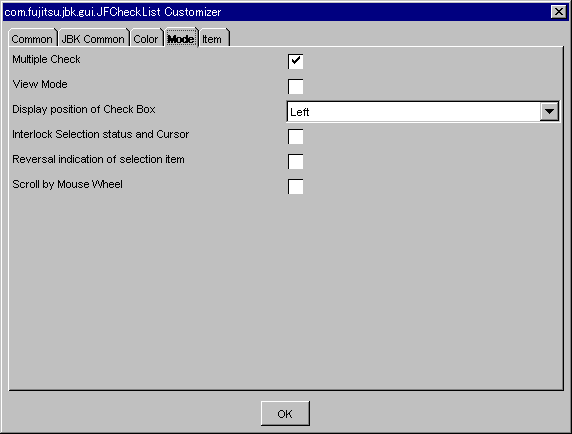
Set multiple check/single check on the check list. If checked, multiple check is enabled. In unchecked, single check is enabled.
Set whether to set/not set the view mode. If checked, the view mode is set such that the check list cannot be checked or selected.
Select the display position of the check box from Top/Left/Bottom/Right.
Set whether the cursor interlocks with the selection status and the check status. If checked, the check status is linked.
Set whether to display the selected item in the inversion mode. If checked, an item, even if selected, is not displayed in the inversion mode.
Set whether to enable scrolling with mouse wheel. If checked, scrolling with mouse wheel operation is enabled.
Item
Set information concerning the checklist items.
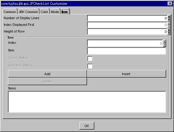
In the initial status, items cannot be set. First, add a null item using the <Add> button, then set information concerning each item. To edit an item, specify the line index to be edited.
Set the number of checklist display lines. Specify from 0 to 2147483647 as the display lines.
Set the first index of the checklist display screen. For the first index of the checklist, set a series of positive integers starting at 0. The maximum value of the first index of the checklist is the number of display rows minus 1.
Note
In case of theses methods may be called before time the check list is displayed, it is error.
If you used the screen designer of the integrated development environment, theses methods specified by 'Index Displayed First' may be called before time the check list is displayed.
Because such a situation leads to an error, use the source editor of the integrated development environment to change the order of calling methods.
Set the height of row. Specify the positive integer for height of the row.
Set the checklist line index. For the index, set a series of positive integers starting at 0. The maximum value of the index is the number of display rows minus 1.
Set the item of the line specified in the index.
Set the check status or unchecked status of the line specified in the index. If this item is checked, the status becomes checked.
Sets the selection status or deselection status of the line selected in the index. If this item is checked, the status becomes selected.
Add a null line to the end of the checklist.
Add a null line immediately before the line specified in the index.
Delete the line specified in the index.
Displays the data specified for the items.