Calendar Bean has the following information and Customizer functions.
See
"Package Guide"- JFCalendarView
Property information
Name | Type | Reference | Setting | Explanation |
|---|---|---|---|---|
alignment | int | Y | Y | Display position of calendar header |
background | java.awt | Y | Y | Background color |
borderColor | java.awt | Y | Y | Border line color |
borderType | int | Y | Y | Border line type |
borderWidth | int | Y | Y | Border line width |
calendarType | int | Y | Y | Display format |
componentOrientation | java.awt | Y | Y | The orientation of the string. It depends on the language |
dateAlignment | int | Y | Y | Date display position |
dayOfMonth | int | Y | Y | Day of the month |
dayOfWeek | int | Y | Days of the week | |
displayDayOfWeek | boolean | Y | Y | Display or non-display of days of the week |
displayHeader | boolean | Y | Y | Display or non-display of calendar header |
displayMemo | boolean | Y | Y | Display or non-display of memo |
enableMenu | boolean | Y | Y | Whether to display the popup menu |
enableToolTip | boolean | Y | Y | Whether to display the tool tip |
enabled | boolean | Y | Y | Whether enabled |
firstDayOfWeek | int | Y | Y | Days of the week displayed first |
focusTraversalKeysEnabled | boolean | Y | Y | Whether the focus traversal key is available |
focusable | boolean | Y | Y | Whether the focus can be set |
font | java.awt | Y | Y | Font |
foreground | java.awt | Y | Y | Foreground color |
formatString | java.lang | Y | Y | Format character string of the character string displayed in the header |
ignoreRepaint | boolean | Y | Y | Whether the paint message of the operating system should be ignored |
imageAlignment | int | Y | Y | Image display position |
locale | java.util | Y | Y | Locale information |
memo | com.fujitsu.jbk.gui | Y | Memo | |
memoBackground | java.awt | Y | Y | Memo background color |
memoForeground | java.awt | Y | Y | Memo foreground color |
month | int | Y | Y | Month |
name | java.lang | Y | Y | Name |
otherBackground | java.awt | Y | Y | Background color of other than the selected month |
otherForeground | java.awt | Y | Y | Foreground color of other than the selected month |
remoteFont | boolean | Y | Whether the registered font is a remote font | |
saturdayBackground | java.awt | Y | Y | Background color of Saturday |
saturdayForeground | java.awt | Y | Y | Foreground color of Saturday |
selectionEnd | com.fujitsu.jbk.gui | Y | Endpoint of range selection | |
selectionMode | int | Y | Y | Multiple selection, single selection, or range selection |
selectionStart | com.fujitsu.jbk.gui | Y | Start point of range selection | |
sundayBackground | java.awt | Y | Y | Background color of Sunday(in holiday use same background color) |
sundayForeground | java.awt | Y | Y | Foreground color of Sunday(in holiday use same foreground color) |
toolTipText | java.lang | Y | Y | Tool tip text |
visible | boolean | Y | Y | Whether visible |
visibleMemoMarker | boolean | Y | Y | Display or non-display of the marker indicating that the memo is set |
weekdayBackground | java.awt | Y | Y | Background color of weekday |
weekdayForeground | java.awt | Y | Y | Foreground color of weekday |
year | int | Y | Y | Year |
Event information
Name | Listener | Addition/removal | Method | Explanation |
|---|---|---|---|---|
action | java.awt.event | addActionListener | actionPerformed | Is issued when the date is double-clicked or the Enter key is pressed. |
component | java.awt.event | addComponentListener | componentResized | Is issued when the component status changes. |
componentMoved | ||||
componentShown | ||||
componentHidden | ||||
focus | java.awt.event | addFocusListener | focusGained | Is issued when the focus moves. |
focusLost | ||||
inputMethod | java.awt.event | addInputMethodListene | caretPositionChanged | Is issued when the input method status changes. |
inputMethodTextChanged | ||||
item | java.awt.event | addItemListener | itemStateChanged | Is issued when the date is selected. |
key | java.awt.event | addKeyListener | keyTyped | Is issued by key operation. |
keyPressed | ||||
keyReleased | ||||
mouse | java.awt.event | addMouseListener | mouseClicked | Is issued by mouse operation. |
mousePressed | ||||
mouseReleased | ||||
mouseEntered | ||||
mouseExited | ||||
mouseMotion | java.awt.event | addMouseMotionListener | mouseDragged | Is issued when the mouse moves. |
mouseMoved | ||||
mouseWheel | java.awt.event | addMouseWheelListener | mouseWheelMoved | Is issued by mouse wheel operation. |
propertyChange | java.beans | addPropertyChangeListener | propertyChange | Is issued when the property changes. |
Method information
Name | Parameters | Explanation |
|---|---|---|
deselect | com.fujitsu.jbk.gui | Deselects the specified date. |
deselectAll | Deselects all dates. | |
hideToolTip | Erases the tool tip. | |
moveDate | int | Moves to the relative day. |
moveMonth | int | Moves to the relative month. |
moveNextDay | Moves to the day after the currently selected day. | |
moveNextMonth | Moves to the next month. | |
moveNextYear | Moves to the next year. | |
movePreviousDay | Moves to the day before the currently selected day. | |
movePreviousMonth | Moves to the previous month. | |
movePreviousYear | Moves to the previous year. | |
moveToday | Moves to the current date. | |
moveYear | int | Moves to the relative year. |
requestFocus | Requests an input focus. | |
select | com.fujitsu.jbk.gui | Selects the specified date. |
select | com.fujitsu.jbk.gui | Selects the date in the specified range. |
com.fujitsu.jbk.gui | ||
showToolTip | java.lang | Displays the tool tip. |
java.awt | ||
java.awt | ||
long | ||
transferFocus | Moves the focus to the next component. |
Customizer
Mode
Set the display and operation mode of the calendar.

Select the date selection mode from among single selection, multiple selection, or range selection.
Select or enter the header format of the calendar from among yyyy.MM.dd, yyyy/M/d, d-MMMM-yy, d-MMMM, or MMMM-yy.
Select the header character string position of the calendar from among left justified, center, or right justified.
Set display or non-display of the days of the week. If this item is checked, the days of the week are displayed.
Set display or non-display of the calendar header. If this item is checked, the calendar header is displayed.
Set display or non-display of the memo mark. If this item is checked, the memo mark is displayed.
Set display or non-display of the memo. If this item is checked, the memo is displayed.
The memo is displayed when the cursor is positioned on the day where the memo is set.
Date
Set the year, month, and day to be displayed in the calendar.

Set the year, month, and day to be displayed in the calendar.
Specify from 1 to 9999 as the year, from 1 to 12 as the month, and from 1 to 31 as the day.
Memo
Specify the year, month, and day, and set the memo.

Set the year, month, and day to set the memo.
Specify from 1 to 9999 as the year, from 1 to 12 as the month, and from 1 to 31 as the day.
Set the memo.
Color
Set the color used for the calendar.

Set the foreground color and background color of the memo. When the button is pressed, [Foreground Color/Background Color] setting dialog is displayed.
Set the foreground color and background color of the previous and subsequent months of the displayed month. When the button is pressed, [Foreground Color/Background Color] setting dialog is displayed.
Set the foreground color and background color of Saturday. When the button is pressed, [Foreground Color/Background Color] setting dialog is displayed.
Set the foreground color and background color of Sunday. When the button is pressed, [Foreground Color/Background Color] setting dialog is displayed.
Set the foreground color and background color of weekday. When the button is pressed, [Foreground Color/Background Color] setting dialog is displayed.
Other
Set other information.
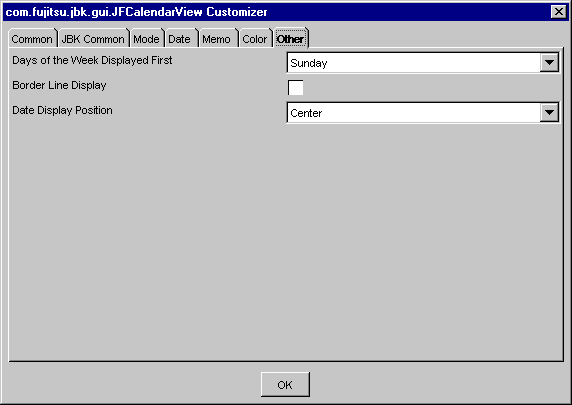
Select the days of the week to be displayed at the beginning of the week.
Set display or non-display of border lines. If this item is checked, borderlines are displayed.
Select the date display position from among Top Left, Top Center, Top Right, Center Left, Center, Center Right, Bottom Left, Bottom Center, or Bottom Right.