The following steps describe how to create a simple toolbar application like the one provided with the PowerCOBOL product in the C:\Program Files\FujitsuCOBOL\COBOL\samples\PowerCOBOL\Toolbar folder. You can use the abc.bmp file from that folder.
Start PowerCOBOL and create a new Standard Form project by selecting New from the File menu. Select Standard Form in the New Project dialog, and click OK.
Right click over the project name ("Untitled") in the left window pane of the Project Manager to display the pop-up menu, and select "Expand All".
PowerCOBOL expands the project tree to show all the project components.
Include the image list in the project by right clicking on the module name "Main" and selecting "Insert File" from the pop-up menu.
Power COBOL displays the Insert File dialog box.
Click on the "Files of Type:" drop down and select "Image List (*.BMP)".
All files with a .BMP extension are displayed.
Navigate to the folder containing the file abc.bmp, select it, and click Open.
PowerCOBOL adds an imagelist item under "Main [Module]" with the name "ImageList1" already selected, ready for you to overtype it with your name for the image list.
Type "ABC" followed by Enter, to give the name ABC to the image list.
You are now ready to create the toolbar control on the form.
Note that the ImageWidth property, displayed in the right-hand pane, defaults to 16 pixels. As this is the width of the bitmaps that make up the image list we do not have to change it. If you were using images of a different size you would need to edit this figure.
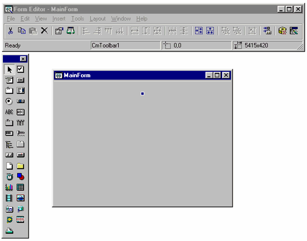
Right click on "MainForm [Form]", and select Open to bring up the Form Editor.
Insert a toolbar by clicking on the Toolbar control  in the tool palette, moving the mouse over the form, and clicking on the form.
A handle appears at the top of the form.
Figure 4.19 A toolbar control on a form.
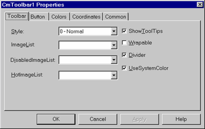
Right click on the (blank) toolbar and select Properties from the pop-up menu.
PowerCOBOL displays the toolbar Properties dialog box.
In the "Image List" field enter "ABC". This tells PowerCOBOL which image list (ABC.BMP) to use for this toolbar.
Figure 4.20 Toolbar properties.
Now click on the Button tab. The Button tab is where you define the details of each element in the toolbar.
Click on the Add command button to define the details for the first toolbar button.
The Index property, which contains the index number of the button, is set to 1.
Each item on the toolbar is referenced using an index number (kind of like a subscript). The index numbers correspond to the physical order of the items on the toolbar from left to right. For example, index 1 is the first item from the left; index 3 is the third button from the left, etc.
Leave the Style property as "0-Normal" (we will discuss other settings later).
The Caption property allows you to specify a caption that is displayed beneath the button. Leave the Caption field blank.
The ToolTipText property is extremely useful. It allows you to enter a description of what the push button does. At runtime, when the user moves the mouse over this button, PowerCOBOL displays a "tooltip" containing the description. Our tooltip will be rather basic: enter "A push button" in the ToolTipText property.
The ImageIndex property is an index into the image list. PowerCOBOL uses the ImageWidth property of the image list to determine the width of the images contained in the image list. It then logically breaks the image list into separate images, numbering them from the left. You set the ImageIndex property to the number of the image you wish to display on this button.
For the first button, set ImageIndex to 1.
Click on the Apply button and you should see a mini icon appear in the toolbar area of the form. Do not click on the OK button yet.
We now add the additional mini icons to the toolbar. Note that for purposes of illustrating features, we will create a small space between this first mini icon and the next one. This space is known as a separator in PowerCOBOL. To create this space, click on the Add button again and click on the Style drop down list.
Notice that there are 4 styles available:
0-Normal - This creates a normal push button mini icon as you did in the steps above.
1-Separator - This creates a separator (a small space between the previous button and the next button).
2-CheckButton - This creates a push button that will remain depressed if the user clicks on it. For example, if you have a button that forces a Bold text style when typing that you wanted to be able to toggle on and off, this is the setting you would use. When a user clicks on the push button, it will remain depressed to show that whatever it represents is still in effect. When the user clicks on it a second time, it will go back to normal.
3-CheckButtonGroup - This allows you to group CheckButtons into a group so that only one button in the group can be depressed at a time. Depressing one button causes a previously depressed button in the group to be raised. This is useful for situations where you have two or more mutually exclusive conditions, for example, if you had three CheckButtons that changed the background color of a form to red, green, or blue, respectively.
Now back to building the toolbar.
In the Style dropdown, select 1-Separator to create a space between the previous icon and the next icon. Click on the Apply button.
Notice that you did not enter a value in the Image Index property because a separator doesn't require an image. Consequently the button Index and the ImageIndex for the following buttons will not be the same.
Click on the Add button again to add the next button.
Leave the Style property as 0-Normal.
Set the ToolTipText property to "B Push Button".
Set the ImageIndex to 2.
Click on the Apply button to see your button added to the toolbar. (You don't have to click on the Apply button after every change but it is often helpful to see the effect of your changes.)
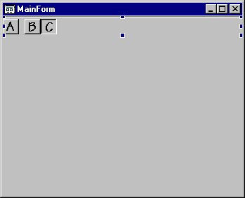
Add the final button without a separator by clicking Add and setting up:
Style as 0-Normal.
ToolTipText as "C Push Button".
ImageIndex as 3.
Click OK.
Your form should now look like this:
Figure 4.21 A form with a toolbar.
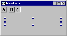
We will now add a static text control to display some text at runtime.
In the toolbox palette select the StaticText control  .
.
Move the pointer over the form and place the static text control to the left of the form near the toolbar.
Use the handles of the static text control to stretch it to about twice its original width.
Double click on the static text control to display the Properties dialog.
In the Properties dialog box, blank out the Caption property, so that no default text is displayed in the static text control.
Now resize the form to match the width and depth of the static text control:
Figure 4.22 The form with a static text box control.
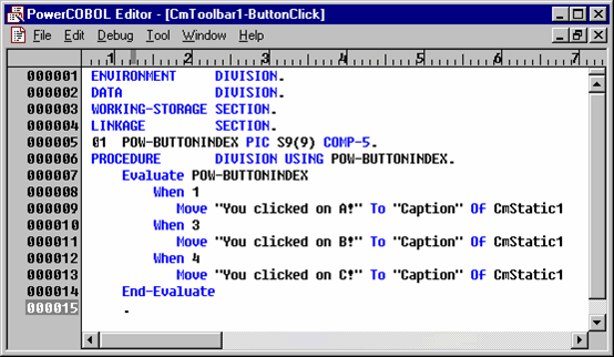
Now it is time to write the event procedure for the toolbar. The behavior we will implement is that whenever a user clicks on one of the buttons in the toolbar, we will display text in the static text control telling which button was clicked.
When a toolbar button is clicked a toolbar event, ButtonClick, is generated (NOT an event unique to the toolbar button). The same event procedure receives all the button clicks. This procedure is passed the Index number of the button that was clicked and can take the appropriate action.
Also recall that, because we have a separator on the toolbar, the button indexes are 1, 3 and 4 (NOT 1, 2 and 3).
Right click on the toolbar and select "Edit the event procedure" from the pop-up menu.
Select ButtonClick from the sub-menu.
PowerCOBOL brings up the PowerCOBOL Editor ready to accept code for the ButtonClick event.
Notice that a value named POW-BUTTONINDEX is being passed into this event procedure. This is the index number of the button that was clicked.
Enter the COBOL code shown below.
Figure 4.23 Event Procedure code for the Toolbar.
Now save the editor session and close it.
Return to the Project Manager window.
Save the project naming it "Toolbar1".
Build the project by right clicking on the project name and selecting the Build All option from the pop-up menu.
If necessary correct any errors and repeat the build.
Once you have a clean build, execute the application by right clicking on the Main module and selecting Execute from the pop-up menu.
When the PowerCOBOL Run-time Environment window appears, click on the OK button.
PowerCOBOL displays the toolbar window:
Figure 4.24 The Toolbar application.
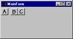
Click on the toolbar buttons.
You should see a text message appear stating which button was clicked.
Hover the mouse over any of the buttons to see the Tooltips.
When you are finished testing out the application, close it.