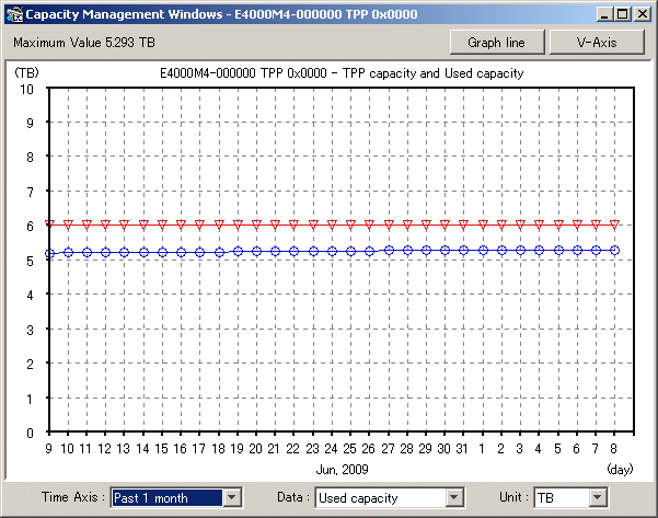
This section describes the Capacity management window that displays graphs of changes in Thin Provisioning Pool capacity.
To display a Capacity management window like the one shown below, select a Thin Provisioning Pool in the Thin Provisioning Pool monitor window, then select [Operation] - [Capacity management window].
Types of graph
The following table shows the graphs that are displayed.
Graph | Description |
|---|---|
Used capacity of Thin Provisioning Pool | The graph shows the physical capacity allocated from the Thin Provisioning Pool to the logical volume. To display this graph, select it from the Displayed content pull-down menu. |
Remaining capacity of Thin Provisioning Pool | The graph shows the physical capacity remaining after subtraction of the "Used capacity of Thin Provisioning Pool" from the Thin Provisioning Pool capacity. To display this graph, select it from the Displayed content pull-down menu. |
Capacity of Thin Provisioning Pool | The graph shows the Thin Provisioning Pool capacity. To display this graph, select "TB" from the Unit pull-down menu. |
Time Axis (pull-down menu)
The following table shows the items that can be selected as the display interval.
Selection item | Description |
|---|---|
Past 1 month | The graph displays data from within a single past month. Plotting points are in units of one day. |
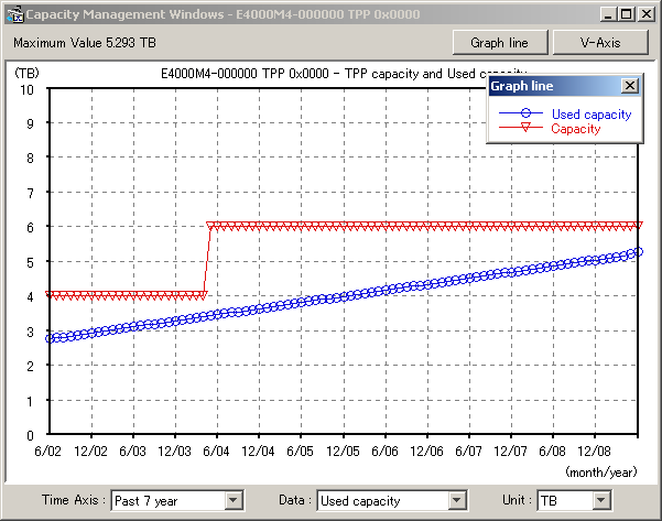
Past N year (N=1,2,…,10) | The graph displays data from within N past years. Plotting points are in units of one month. |
Data (pull-down menu)
The following table shows the items that can be selected as the content to be displayed.
Selection item | Description |
|---|---|
Used capacity | The graph data shows the Thin Provisioning Pool capacity used. |
Remain capacity | The graph data shows the remaining Thin Provisioning Pool capacity. |
Unit (pull-down menu)
The following table shows the items that can be selected as the unit.
Selection item | Description |
|---|---|
TB | The Thin Provisioning Pool capacity and the item selected from the Displayed content pull-down menu are shown in graphs in TB units. |
% | The Thin Provisioning Pool capacity for the item selected from the Displayed content pull-down menu is shown in graphs as a percentage. |
Graph Line button
When "TB" is selected from the Unit pull-down menu, the <Graph Line> button at the upper right of the window becomes clickable. Clicking this button displays a window that explains the graph line names.
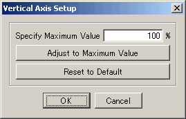
Set Vertical Axis button
Clicking the <V-Axis> button at the upper right of the screen displays the dialog shown below. In this dialog, the maximum value of the vertical axis of a graph can be specified. The value can be entered directly. However, clicking the <Adjust to Maximum Value> button automatically calculates and displays the maximum value for a graph. Clicking the <Reset to Default> button sets the maximum value of the standard vertical axis of capacity management.